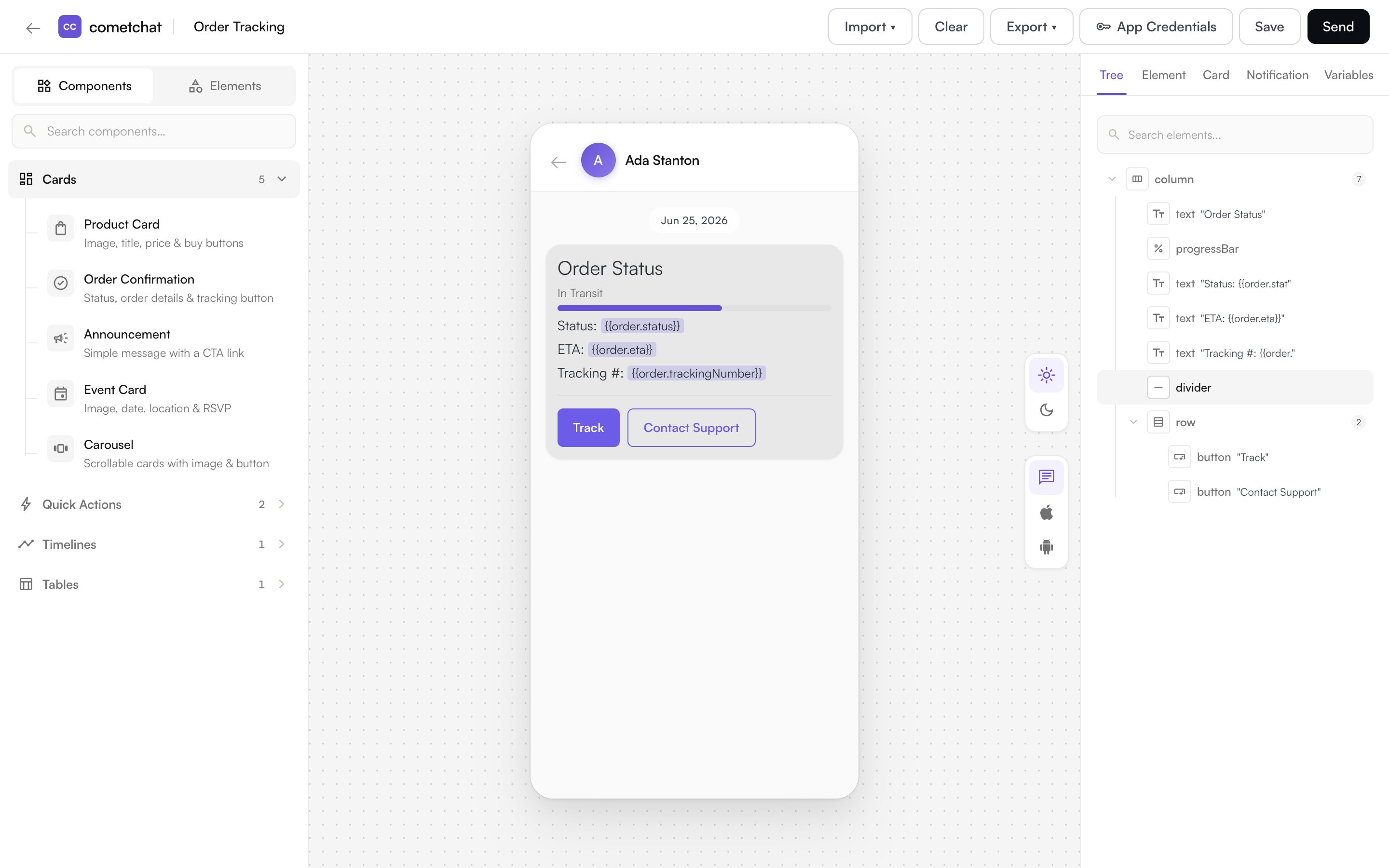
- Design cards visually — add text, images, buttons, and layouts and see them on a live canvas.
- Add interactivity — wire buttons and links to actions like opening a URL, starting a chat, or making a call.
- Use variables — insert placeholders such as
{{user.name}}that are filled in when the card is sent. - Preview in light and dark mode — set colors for each mode and see the result instantly.
- Save and reuse templates — store finished cards and load them again whenever you need them.
What You Can Build
Start from a blank card, or from a ready-made template — Product Card, Order Confirmation, Order Tracking, Event Card, Announcement, Quick Reply Buttons, and more. See the full set in Components.How to Open Card Builder
Card Builder opens in a new browser tab from the dashboard:- For chat — open your app in the CometChat Dashboard, expand Chat & Messaging in the sidebar, and select Card Builder.
- For an AI Agent — open your agent and select Card Builder from the agent configuration menu.
Card Builder is available to app owners, admins, and developers.
The Design Workflow
- Choose a starting point — open a blank card or a template from the library.
- Build the card — add elements from the palette and arrange them with rows, columns, and grids.
- Style and preview — set colors, spacing, and corner radius, and preview in light and dark mode.
- Add actions and variables — make buttons interactive and insert
{{placeholder}}values. - Save — save the card as a template to reuse it later.