What You’ll Build
A single card that shows order status at a glance and lets the customer act on it:- An Order Status heading (heading style)
- A progress bar labelled In Transit, filled to the current stage
- Three rows — Status, ETA, and Tracking # — filled from
{{order.*}}variables - A divider
- Two buttons in a row — Track and Contact Support
Prerequisites
- Access to Card Builder in your app — see Overview for how to open it.
- Familiarity with the editor layout — see Building Cards.
Steps
Step 1 — Start a blank card
In the template library, click + New Card. The editor opens with an empty canvas (“Click an element or component to add it here”). Switch the left palette to the Elements tab — elements are grouped under Layout, Content, Data Display, and Actions.Step 2 — Add the heading
From Content, click Text to add it, then in the Element tab set its content toOrder Status and change its Variant to heading2.
Step 3 — Add the progress bar and status rows
From Data Display, add a Progress Bar. In the Element tab set its Value to60 and its Label to In Transit (the label renders just below the heading).
Then add three more Text elements and, in each, type the label and insert a variable from the variable picker:
| Text element | Content |
|---|---|
| Status | Status: {{order.status}} |
| ETA | ETA: {{order.eta}} |
| Tracking # | Tracking #: {{order.trackingNumber}} |
Step 4 — Add a divider and the buttons
From Layout, add a Divider. Then add a Row so the buttons sit side by side — with the row selected, add a Button (it nests inside the row) and set its label toTrack. Select the row again, add a second Button, and label it Contact Support.
Step 5 — Give the buttons their actions
Select a button, scroll to the Action section, and choose an action:- Track → Open URL, with the URL
https://example.com/track/{{order.trackingNumber}}(variables work in URLs too). - Contact Support → Chat with user, with the support agent’s user ID.
Step 6 — Set the message type and fallback text
Open the Card tab. Set the message Type toorder_status — a meaningful identifier your app can use to recognize this kind of card (it defaults to custom_type).
Then fill in Fallback Text. This is what a CometChat UI Kit renders if it ever can’t display the card itself — for example if the card JSON is malformed or the client doesn’t support cards — so the message still conveys its meaning. Because the card (and its buttons) won’t be shown in that case, write plain copy that stands on its own and doesn’t reference interactive elements like “tap Track”. For this card:
Your order is in transit. We’ll notify you when it’s out for delivery.
Step 7 — Save
Give the card a name (for example, Order Status) in the top bar and click Save. It now appears under Saved Templates and can be reused or edited any time.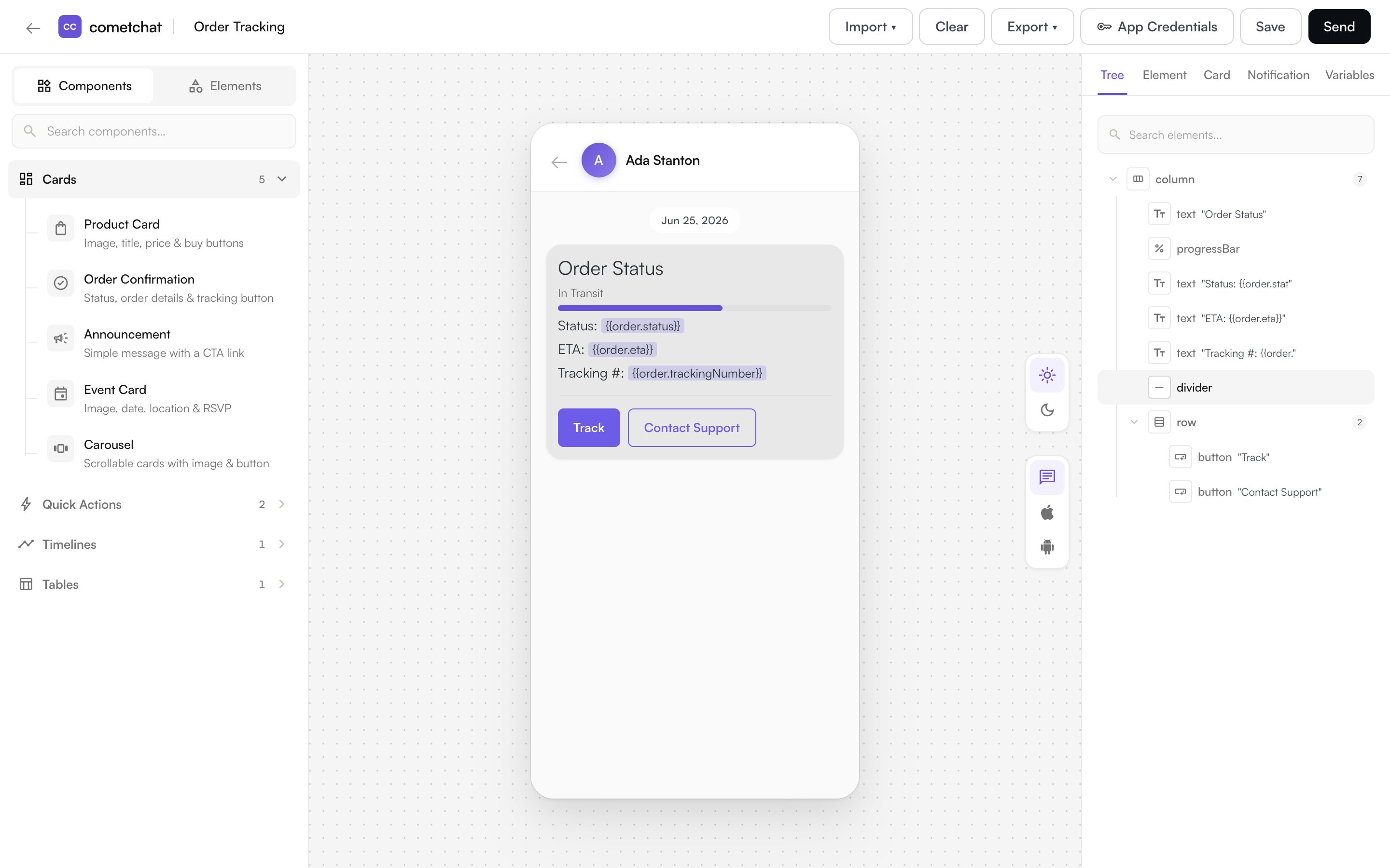
Next steps
- Browse what else a card can hold in Elements & Actions.
- Reuse this card as a saved template for future orders.