> ## Documentation Index
> Fetch the complete documentation index at: https://cometchat-22654f5b-feature-card-builder.mintlify.site/llms.txt
> Use this file to discover all available pages before exploring further.
# Threaded Message Preview
> Threaded Message Preview — CometChat documentation.
## Overview
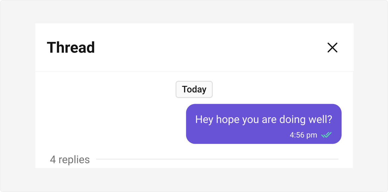
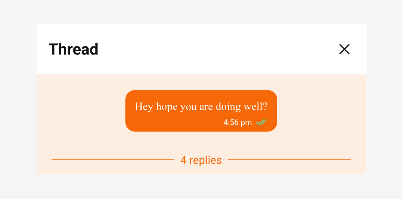
CometChatThreadedMessagePreview is a Component that displays the parent message & number of replies of thread.
 ## Usage
### Integration
The following code snippet illustrates how you can directly incorporate the CometChatThreadedMessagePreview component into your Application.
```tsx theme={null}
import React from "react";
import { CometChatThreadedMessagePreview } from "@cometchat/chat-uikit-react";
import { CometChat } from "@cometchat/chat-sdk-javascript";
export function ThreadedMessagePreviewDemo() {
const [parentMessage, setParentMessage] =
React.useState();
const [chatWithUser, setChatWithUser] = React.useState();
React.useEffect(() => {
CometChat.getUser("uid").then((user) => {
setChatWithUser(user);
});
CometChat.getMessageDetails("Parent Message Id").then((message) => {
setParentMessage(message);
});
}, []);
return chatWithUser && parentMessage ? (
) : null;
}
```
```tsx theme={null}
import { ThreadedMessagePreviewDemo } from "./ThreadedMessagePreviewDemo";
export default function App() {
return (
);
}
```
***
### Actions
[Actions](/ui-kit/react/v5/components-overview#actions) dictate how a component functions. They are divided into two types: Predefined and User-defined. You can override either type, allowing you to tailor the behavior of the component to fit your specific needs.
**Example**
In this example, we are overriding the `onClose` of the ThreadedMesssage Component.
```tsx theme={null}
import React from "react";
import { CometChatThreadedMessagePreview } from "@cometchat/chat-uikit-react";
import { CometChat } from "@cometchat/chat-sdk-javascript";
export function ThreadedMessagePreviewDemo() {
const [parentMessage, setParentMessage] =
React.useState();
const [chatWithUser, setChatWithUser] = React.useState();
React.useEffect(() => {
CometChat.getUser("uid").then((user) => {
setChatWithUser(user);
});
CometChat.getMessageDetails("Parent Message Id").then((message) => {
setParentMessage(message);
});
}, []);
const handleClose = () => {
console.log("your custom on close action");
};
return chatWithUser && parentMessage ? (
) : null;
}
```
***
### Events
[Events](/ui-kit/react/v5/components-overview#events) are emitted by a `Component`. By using event you can extend existing functionality. Being global events, they can be applied in Multiple Locations and are capable of being Added or Removed.
The ThreadedMessagePreview Component does not emit any events of its own.
***
## Customization
To fit your app's design requirements, you can customize the appearance of the conversation component. We provide exposed methods that allow you to modify the experience and behavior according to your specific needs.
***
### Style
Using Style you can customize the look and feel of the component in your app, These parameters typically control elements such as the color, size, shape, and fonts used within the component.
**Example**
## Usage
### Integration
The following code snippet illustrates how you can directly incorporate the CometChatThreadedMessagePreview component into your Application.
```tsx theme={null}
import React from "react";
import { CometChatThreadedMessagePreview } from "@cometchat/chat-uikit-react";
import { CometChat } from "@cometchat/chat-sdk-javascript";
export function ThreadedMessagePreviewDemo() {
const [parentMessage, setParentMessage] =
React.useState();
const [chatWithUser, setChatWithUser] = React.useState();
React.useEffect(() => {
CometChat.getUser("uid").then((user) => {
setChatWithUser(user);
});
CometChat.getMessageDetails("Parent Message Id").then((message) => {
setParentMessage(message);
});
}, []);
return chatWithUser && parentMessage ? (
) : null;
}
```
```tsx theme={null}
import { ThreadedMessagePreviewDemo } from "./ThreadedMessagePreviewDemo";
export default function App() {
return (
);
}
```
***
### Actions
[Actions](/ui-kit/react/v5/components-overview#actions) dictate how a component functions. They are divided into two types: Predefined and User-defined. You can override either type, allowing you to tailor the behavior of the component to fit your specific needs.
**Example**
In this example, we are overriding the `onClose` of the ThreadedMesssage Component.
```tsx theme={null}
import React from "react";
import { CometChatThreadedMessagePreview } from "@cometchat/chat-uikit-react";
import { CometChat } from "@cometchat/chat-sdk-javascript";
export function ThreadedMessagePreviewDemo() {
const [parentMessage, setParentMessage] =
React.useState();
const [chatWithUser, setChatWithUser] = React.useState();
React.useEffect(() => {
CometChat.getUser("uid").then((user) => {
setChatWithUser(user);
});
CometChat.getMessageDetails("Parent Message Id").then((message) => {
setParentMessage(message);
});
}, []);
const handleClose = () => {
console.log("your custom on close action");
};
return chatWithUser && parentMessage ? (
) : null;
}
```
***
### Events
[Events](/ui-kit/react/v5/components-overview#events) are emitted by a `Component`. By using event you can extend existing functionality. Being global events, they can be applied in Multiple Locations and are capable of being Added or Removed.
The ThreadedMessagePreview Component does not emit any events of its own.
***
## Customization
To fit your app's design requirements, you can customize the appearance of the conversation component. We provide exposed methods that allow you to modify the experience and behavior according to your specific needs.
***
### Style
Using Style you can customize the look and feel of the component in your app, These parameters typically control elements such as the color, size, shape, and fonts used within the component.
**Example**
 ```tsx theme={null}
import React from "react";
import { CometChatThreadedMessagePreview } from "@cometchat/chat-uikit-react";
import { CometChat } from "@cometchat/chat-sdk-javascript";
export function ThreadedMessagePreviewDemo() {
const [parentMessage, setParentMessage] =
React.useState();
const [chatWithUser, setChatWithUser] = React.useState();
React.useEffect(() => {
CometChat.getUser("uid").then((user) => {
setChatWithUser(user);
});
CometChat.getMessageDetails("Parent Message Id").then((message) => {
setParentMessage(message);
});
}, []);
return chatWithUser && parentMessage ? (
) : null;
}
```
```css theme={null}
.cometchat .cometchat-threaded-message-preview {
background-color: #edeafa;
}
.cometchat .cometchat-threaded-message-preview__footer-reply-count {
color: #6852d6;
}
.cometchat .cometchat-threaded-message-preview__footer-divider {
color: #6852d6;
}
```
***
### Functionality
These are a set of small functional customizations that allow you to fine-tune the overall experience of the component. With these, you can change text, set custom icons, and toggle the visibility of UI elements.
```tsx theme={null}
import React from "react";
import { CometChatThreadedMessagePreview } from "@cometchat/chat-uikit-react";
import { CometChat } from "@cometchat/chat-sdk-javascript";
const messageBubbleView = () => {
return
```tsx theme={null}
import React from "react";
import { CometChatThreadedMessagePreview } from "@cometchat/chat-uikit-react";
import { CometChat } from "@cometchat/chat-sdk-javascript";
export function ThreadedMessagePreviewDemo() {
const [parentMessage, setParentMessage] =
React.useState();
const [chatWithUser, setChatWithUser] = React.useState();
React.useEffect(() => {
CometChat.getUser("uid").then((user) => {
setChatWithUser(user);
});
CometChat.getMessageDetails("Parent Message Id").then((message) => {
setParentMessage(message);
});
}, []);
return chatWithUser && parentMessage ? (
) : null;
}
```
```css theme={null}
.cometchat .cometchat-threaded-message-preview {
background-color: #edeafa;
}
.cometchat .cometchat-threaded-message-preview__footer-reply-count {
color: #6852d6;
}
.cometchat .cometchat-threaded-message-preview__footer-divider {
color: #6852d6;
}
```
***
### Functionality
These are a set of small functional customizations that allow you to fine-tune the overall experience of the component. With these, you can change text, set custom icons, and toggle the visibility of UI elements.
```tsx theme={null}
import React from "react";
import { CometChatThreadedMessagePreview } from "@cometchat/chat-uikit-react";
import { CometChat } from "@cometchat/chat-sdk-javascript";
const messageBubbleView = () => {
return your custom bubble view
;
};
export function ThreadedMessagePreviewDemo() {
const [parentMessage, setParentMessage] =
React.useState();
const [chatWithUser, setChatWithUser] = React.useState();
React.useEffect(() => {
CometChat.getUser("uid").then((user) => {
setChatWithUser(user);
});
CometChat.getMessageDetails("Parent Message Id").then((message) => {
setParentMessage(message);
});
}, []);
return chatWithUser && parentMessage ? (
) : null;
}
```
Below is a list of customizations along with corresponding code snippets
| Property | Description | Code |
| ------------------------------------------------- | -------------------------------------------------------------------- | --------------------------------------------------------------------------------- |
| **Hide Date** | Hides the visibility of the date header. | `hideDate={true}` |
| **Hide Reply Count** | Hides the visibility of the reply count. | `hideReplyCount={true}` |
| **Show Scrollbar** | Controls the visibility of the scrollbar in the preview area. | `showScrollbar={true}` |
| **Parent Message** | Represents the parent message for displaying threaded conversations. | `parentMessage={message}` |
| [**Template**](/ui-kit/react/v5/message-template) | Template for customizing the appearance of the message. | `template={"PASS_CUSTOM_MESSAGE_TEMPLATE"}` |
| **Message Bubble View** | A custom view for rendering the message bubble. | `messageBubbleView={(message: CometChat.BaseMessage) => <>Custom Bubble View}` |
| **On Error** | Callback function triggered when an error occurs. | `onError={(error: CometChat.CometChatException) => console.log(error)}` |