No users found.
 Customized:
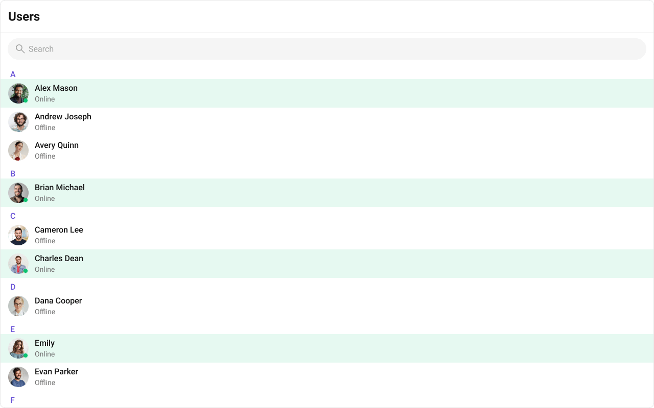
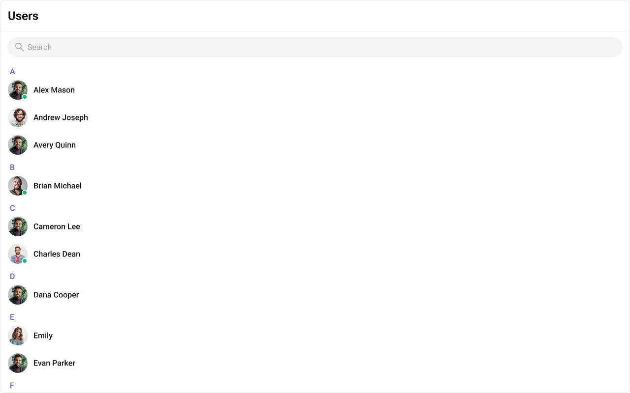
{user.getName()}
{user.getStatus()}
);
};
return 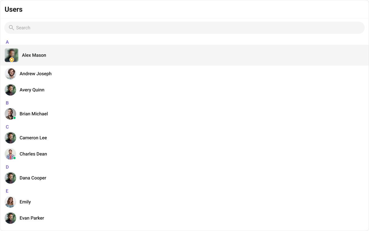
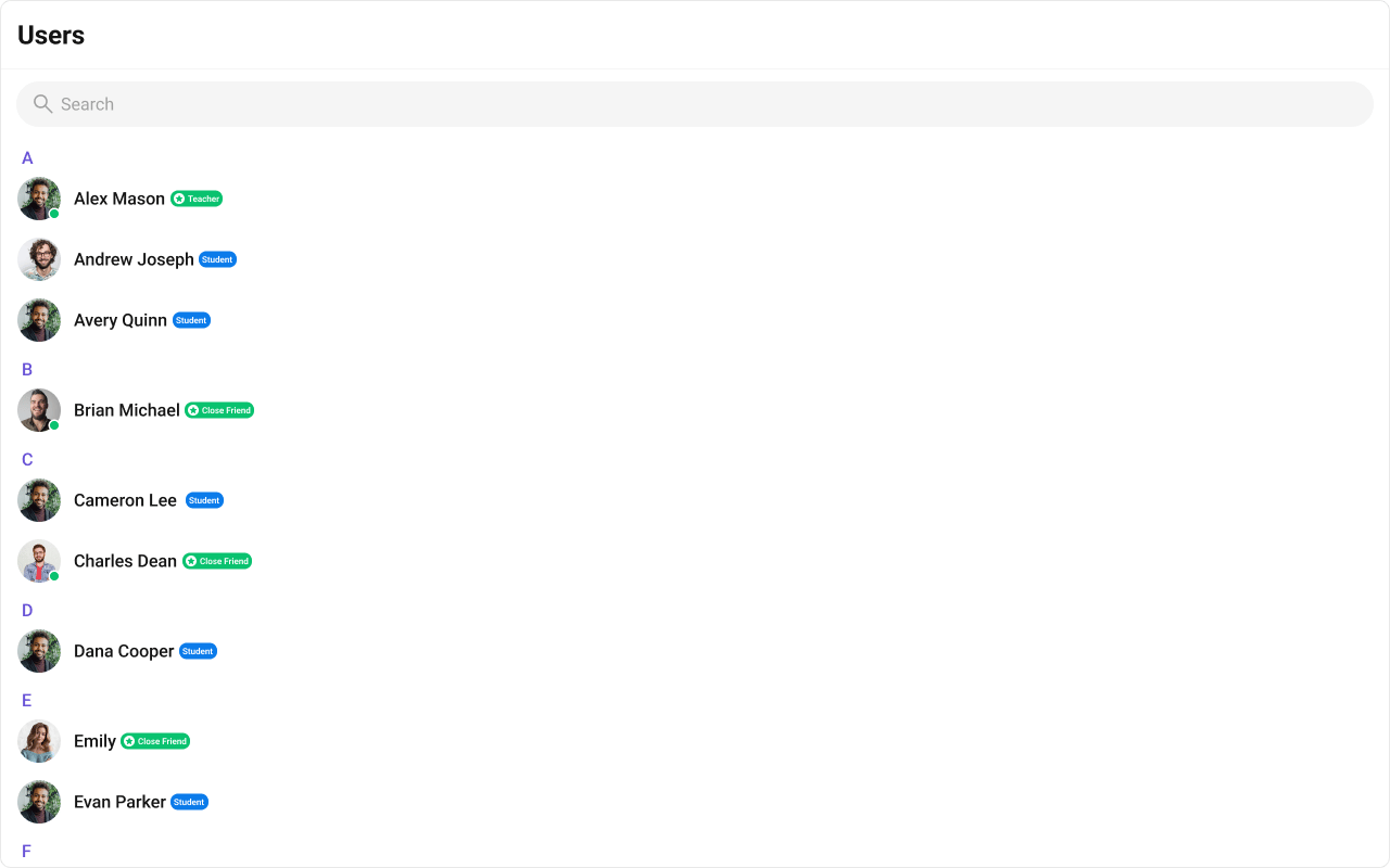
{user.getName()}
{user.getRole()}
);
};
return 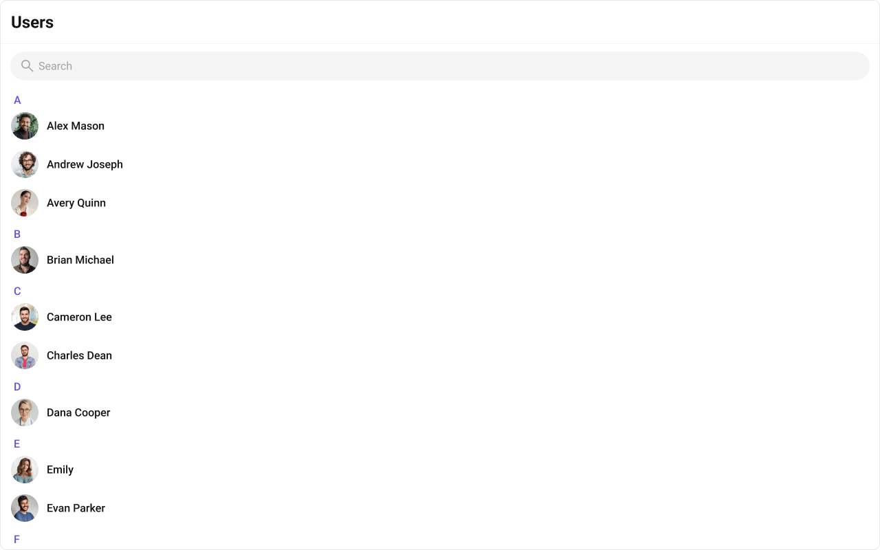 Customized:
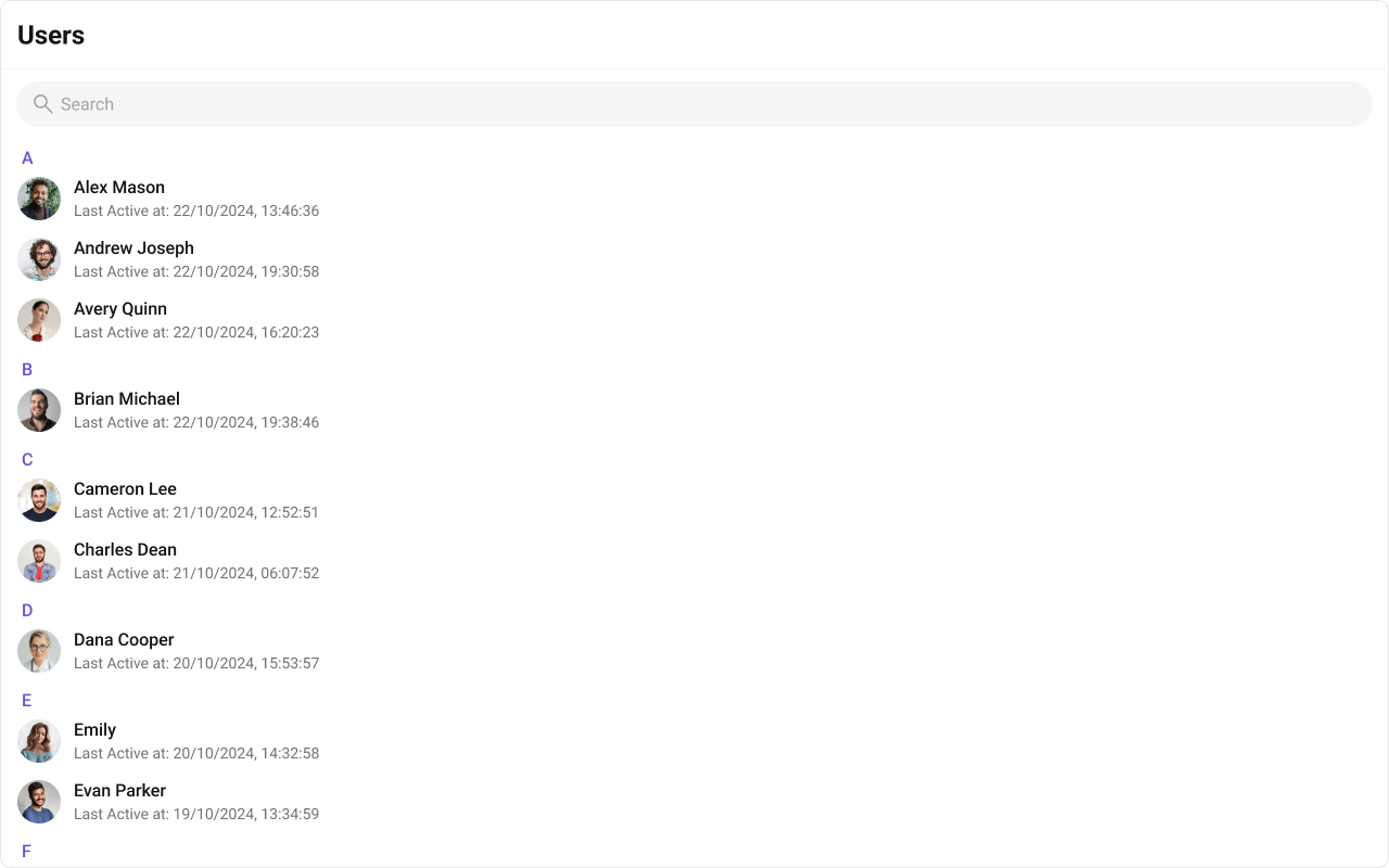
{user.getStatusMessage() || user.getStatus()}
);
};
return 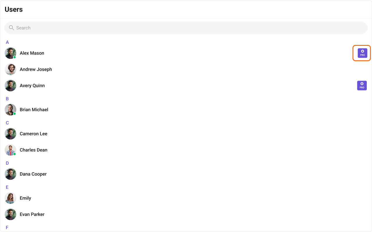
{tag}
);
};
return