> ## Documentation Index
> Fetch the complete documentation index at: https://cometchat-22654f5b-feature-card-builder.mintlify.site/llms.txt
> Use this file to discover all available pages before exploring further.
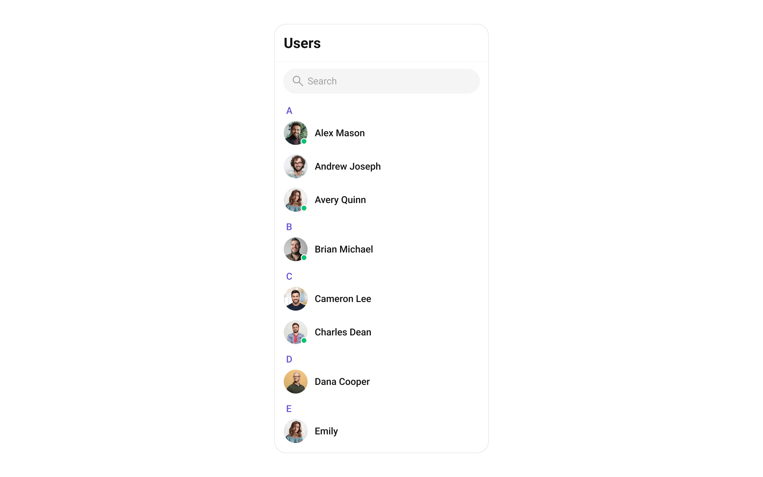
# Users
> Searchable, scrollable list of all available users with avatar, name, and online/offline status.
```json theme={null}
{
"component": "CometChatUsers",
"package": "cometchat_chat_uikit",
"import": "import 'package:cometchat_chat_uikit/cometchat_chat_uikit.dart';",
"description": "Searchable, scrollable list of all available users with avatar, name, and online/offline status.",
"primaryOutput": {
"prop": "onItemTap",
"type": "Function(BuildContext context, User user)"
},
"props": {
"data": {
"usersRequestBuilder": {
"type": "UsersRequestBuilder?",
"default": "SDK default (30 per page)",
"note": "Pass the builder, not the result of .build()"
},
"usersProtocol": {
"type": "UsersBuilderProtocol?",
"default": "null",
"note": "Custom protocol for fetching users"
},
"scrollController": {
"type": "ScrollController?",
"default": "null",
"note": "Custom scroll controller for the list"
},
"title": {
"type": "String?",
"default": "Users",
"note": "Title text for the app bar"
},
"controllerTag": {
"type": "String?",
"default": "null",
"note": "Tag for controller management"
},
"searchPlaceholder": {
"type": "String?",
"default": "null",
"note": "Placeholder text for search input"
},
"searchKeyword": {
"type": "String?",
"default": "null",
"note": "Pre-fills search and filters list"
},
"height": {
"type": "double?",
"default": "null"
},
"width": {
"type": "double?",
"default": "null"
}
},
"callbacks": {
"onItemTap": "Function(BuildContext context, User user)?",
"onItemLongPress": "Function(BuildContext context, User user)?",
"onSelection": "Function(List? list, BuildContext context)?",
"onBack": "VoidCallback?",
"onError": "OnError?",
"onLoad": "OnLoad?",
"onEmpty": "OnEmpty?"
},
"visibility": {
"usersStatusVisibility": { "type": "bool?", "default": true },
"hideAppbar": { "type": "bool?", "default": false },
"hideSearch": { "type": "bool", "default": false },
"showBackButton": { "type": "bool", "default": true },
"stickyHeaderVisibility": { "type": "bool?", "default": false }
},
"selection": {
"selectionMode": {
"type": "SelectionMode?",
"values": ["SelectionMode.single", "SelectionMode.multiple", "SelectionMode.none"],
"default": "null"
},
"activateSelection": {
"type": "ActivateSelection?",
"values": ["ActivateSelection.onClick", "ActivateSelection.onLongClick"],
"default": "null"
}
},
"viewSlots": {
"listItemView": "Widget Function(User user)?",
"leadingView": "Widget? Function(BuildContext context, User user)?",
"titleView": "Widget? Function(BuildContext context, User user)?",
"subtitleView": "Widget? Function(BuildContext context, User user)?",
"trailingView": "Widget? Function(BuildContext context, User user)?",
"loadingStateView": "WidgetBuilder?",
"emptyStateView": "WidgetBuilder?",
"errorStateView": "WidgetBuilder?",
"setOptions": "List? Function(User, CometChatUsersController, BuildContext)?",
"addOptions": "List? Function(User, CometChatUsersController, BuildContext)?",
"appBarOptions": "List Function(BuildContext context)?"
},
"icons": {
"backButton": { "type": "Widget?", "default": "built-in back arrow" },
"searchBoxIcon": { "type": "Widget?", "default": "built-in search icon" },
"submitIcon": { "type": "Widget?", "default": "built-in check icon" }
},
"style": {
"usersStyle": { "type": "CometChatUsersStyle", "default": "CometChatUsersStyle()" }
}
},
"events": [
{
"name": "CometChatUserEvents.ccUserBlocked",
"payload": "User",
"description": "User blocked"
},
{
"name": "CometChatUserEvents.ccUserUnblocked",
"payload": "User",
"description": "User unblocked"
}
],
"sdkListeners": [
"onUserOnline",
"onUserOffline",
"ccUserBlocked",
"ccUserUnblocked",
"onConnected"
],
"compositionExample": {
"description": "User list wired to message view",
"components": [
"CometChatUsers",
"CometChatMessages",
"CometChatMessageHeader",
"CometChatMessageList",
"CometChatMessageComposer"
],
"flow": "onItemTap emits User -> pass to CometChatMessages or individual message components"
},
"types": {
"CometChatOption": {
"id": "String?",
"title": "String?",
"icon": "String?",
"iconWidget": "Widget?",
"onClick": "VoidCallback?"
},
"SelectionMode": {
"single": "SelectionMode.single",
"multiple": "SelectionMode.multiple",
"none": "SelectionMode.none"
},
"ActivateSelection": {
"onClick": "ActivateSelection.onClick",
"onLongClick": "ActivateSelection.onLongClick"
}
}
}
```
## Where It Fits
`CometChatUsers` is a contact list widget. It renders all available users and emits the selected `User` via `onItemTap`. Wire it to `CometChatMessages` or individual message components (`CometChatMessageHeader`, `CometChatMessageList`, `CometChatMessageComposer`) to build a standard two-panel chat layout.
```dart theme={null}
import 'package:flutter/material.dart';
import 'package:cometchat_chat_uikit/cometchat_chat_uikit.dart';
class ChatApp extends StatefulWidget {
const ChatApp({super.key});
@override
State createState() => _ChatAppState();
}
class _ChatAppState extends State {
User? selectedUser;
@override
Widget build(BuildContext context) {
return Scaffold(
body: Row(
children: [
SizedBox(
width: 400,
child: CometChatUsers(
onItemTap: (context, user) {
setState(() {
selectedUser = user;
});
},
),
),
Expanded(
child: selectedUser != null
? CometChatMessages(user: selectedUser)
: const Center(child: Text('Select a user')),
),
],
),
);
}
}
```
 ***
## Minimal Render
```dart theme={null}
import 'package:flutter/material.dart';
import 'package:cometchat_chat_uikit/cometchat_chat_uikit.dart';
class UsersDemo extends StatelessWidget {
const UsersDemo({super.key});
@override
Widget build(BuildContext context) {
return const Scaffold(
body: SafeArea(
child: CometChatUsers(),
),
);
}
}
```
You can also launch it using `Navigator.push`:
```dart theme={null}
Navigator.push(
context,
MaterialPageRoute(builder: (context) => const CometChatUsers())
);
```
***
## Filtering Users
Pass a `UsersRequestBuilder` to `usersRequestBuilder`. Pass the builder instance — not the result of `.build()`.
```dart theme={null}
CometChatUsers(
usersRequestBuilder: UsersRequestBuilder()
..friendsOnly = true
..limit = 15,
)
```
### Filter Recipes
| Recipe | Code |
| -------------------- | ---------------------------------------------------------------- |
| Friends only | `UsersRequestBuilder()..friendsOnly = true` |
| Online users only | `UsersRequestBuilder()..userStatus = CometChatUserStatus.online` |
| Limit to 15 per page | `UsersRequestBuilder()..limit = 15` |
| Search by keyword | `UsersRequestBuilder()..searchKeyword = "alice"` |
| Hide blocked users | `UsersRequestBuilder()..hideBlockedUsers = true` |
| Filter by roles | `UsersRequestBuilder()..roles = ["admin", "moderator"]` |
| Filter by tags | `UsersRequestBuilder()..tags = ["vip"]` |
| Specific UIDs | `UsersRequestBuilder()..uids = ["uid1", "uid2"]` |
Default page size is 30. The component uses infinite scroll — the next page loads as the user scrolls to the bottom.
### UsersRequestBuilder Properties
| Property | Description | Code |
| ------------------ | -------------------------------------------------------------------------------- | ------------------------------------------- |
| `limit` | Number of users to fetch per request. Maximum 100. | `..limit = 30` |
| `searchKeyword` | Search users by name. | `..searchKeyword = "John"` |
| `friendsOnly` | Fetch only friends. Default `false`. | `..friendsOnly = true` |
| `userStatus` | Filter by status: `CometChatUserStatus.online` or `CometChatUserStatus.offline`. | `..userStatus = CometChatUserStatus.online` |
| `hideBlockedUsers` | Hide blocked users from the list. Default `false`. | `..hideBlockedUsers = true` |
| `roles` | Filter users by specific roles. | `..roles = ["admin"]` |
| `tags` | Filter users by specific tags. | `..tags = ["vip"]` |
| `withTags` | Include tags in the User object. Default `false`. | `..withTags = true` |
| `uids` | Fetch specific users by UIDs. | `..uids = ["uid1", "uid2"]` |
| `build()` | Builds and returns a `UsersRequest` object. | `.build()` |
Refer to [UsersRequestBuilder](/sdk/flutter/retrieve-users) for the full builder API.
***
## Actions and Events
### Callback Props
#### onItemTap
Fires when a user row is tapped. Primary navigation hook — set the active user and render the message view.
```dart theme={null}
CometChatUsers(
onItemTap: (context, user) {
print("Selected: ${user.name}");
},
)
```
#### onItemLongPress
Fires when a user row is long-pressed. Useful for showing context menus or custom actions.
```dart theme={null}
CometChatUsers(
onItemLongPress: (context, user) {
// Show custom context menu
},
)
```
#### onSelection
Fires when users are selected in multi-select mode. Requires `selectionMode` to be set.
```dart theme={null}
CometChatUsers(
selectionMode: SelectionMode.multiple,
activateSelection: ActivateSelection.onClick,
onSelection: (selectedList, context) {
print("Selected ${selectedList?.length ?? 0} users");
},
)
```
#### onError
Fires on internal errors (network failure, auth issue, SDK exception).
```dart theme={null}
CometChatUsers(
onError: (error) {
print("CometChatUsers error: $error");
},
)
```
#### onBack
Fires when the back button is pressed.
```dart theme={null}
CometChatUsers(
showBackButton: true,
onBack: () {
Navigator.pop(context);
},
)
```
#### onLoad
Fires when the user list is successfully loaded.
```dart theme={null}
CometChatUsers(
onLoad: (list) {
print("Loaded ${list.length} users");
},
)
```
#### onEmpty
Fires when the user list is empty.
```dart theme={null}
CometChatUsers(
onEmpty: () {
print("No users found");
},
)
```
### Global UI Events
`CometChatUserEvents` emits events subscribable from anywhere in the application. Add a listener in `initState` and remove it in `dispose`.
| Event | Fires when | Payload |
| ----------------- | ------------------- | ------- |
| `ccUserBlocked` | A user is blocked | `User` |
| `ccUserUnblocked` | A user is unblocked | `User` |
When to use: sync external UI with user state changes. For example, update a blocked users count badge when a user is blocked.
```dart theme={null}
import 'package:cometchat_chat_uikit/cometchat_chat_uikit.dart';
class _YourScreenState extends State with CometChatUserEventListener {
@override
void initState() {
super.initState();
CometChatUserEvents.addUsersListener("listenerId", this);
}
@override
void dispose() {
CometChatUserEvents.removeUsersListener("listenerId");
super.dispose();
}
@override
void ccUserBlocked(User user) {
print("Blocked: ${user.name}");
}
@override
void ccUserUnblocked(User user) {
print("Unblocked: ${user.name}");
}
@override
Widget build(BuildContext context) {
return const Placeholder();
}
}
```
### SDK Events (Real-Time, Automatic)
The component listens to these SDK events internally. No manual attachment needed unless additional side effects are required.
| SDK Listener | Internal behavior |
| ----------------- | ----------------------------------------------------- |
| `onUserOnline` | Updates the user's status indicator to online |
| `onUserOffline` | Updates the user's status indicator to offline |
| `ccUserBlocked` | Updates blocked user in list |
| `ccUserUnblocked` | Updates unblocked user in list |
| `onConnected` | Refreshes user list when connection is re-established |
Automatic: user presence changes (online/offline), blocked/unblocked state, connection recovery.
***
## Custom View Slots
Each slot replaces a section of the default UI. Slots that accept a user parameter receive the `User` object for that row.
| Slot | Signature | Replaces |
| ------------------ | ------------------------------------------------------------------------------- | --------------------------------------- |
| `listItemView` | `Widget Function(User)` | Entire list item row |
| `leadingView` | `Widget? Function(BuildContext, User)` | Avatar / left section |
| `titleView` | `Widget? Function(BuildContext, User)` | Name / title text |
| `subtitleView` | `Widget? Function(BuildContext, User)` | Subtitle text |
| `trailingView` | `Widget? Function(BuildContext, User)` | Right section |
| `loadingStateView` | `WidgetBuilder` | Loading spinner |
| `emptyStateView` | `WidgetBuilder` | Empty state |
| `errorStateView` | `WidgetBuilder` | Error state |
| `setOptions` | `List? Function(User, CometChatUsersController, BuildContext)` | Context menu actions (replaces default) |
| `addOptions` | `List? Function(User, CometChatUsersController, BuildContext)` | Context menu actions (adds to default) |
| `appBarOptions` | `List Function(BuildContext)` | App bar action widgets |
### listItemView
Replace the entire list item row.
***
## Minimal Render
```dart theme={null}
import 'package:flutter/material.dart';
import 'package:cometchat_chat_uikit/cometchat_chat_uikit.dart';
class UsersDemo extends StatelessWidget {
const UsersDemo({super.key});
@override
Widget build(BuildContext context) {
return const Scaffold(
body: SafeArea(
child: CometChatUsers(),
),
);
}
}
```
You can also launch it using `Navigator.push`:
```dart theme={null}
Navigator.push(
context,
MaterialPageRoute(builder: (context) => const CometChatUsers())
);
```
***
## Filtering Users
Pass a `UsersRequestBuilder` to `usersRequestBuilder`. Pass the builder instance — not the result of `.build()`.
```dart theme={null}
CometChatUsers(
usersRequestBuilder: UsersRequestBuilder()
..friendsOnly = true
..limit = 15,
)
```
### Filter Recipes
| Recipe | Code |
| -------------------- | ---------------------------------------------------------------- |
| Friends only | `UsersRequestBuilder()..friendsOnly = true` |
| Online users only | `UsersRequestBuilder()..userStatus = CometChatUserStatus.online` |
| Limit to 15 per page | `UsersRequestBuilder()..limit = 15` |
| Search by keyword | `UsersRequestBuilder()..searchKeyword = "alice"` |
| Hide blocked users | `UsersRequestBuilder()..hideBlockedUsers = true` |
| Filter by roles | `UsersRequestBuilder()..roles = ["admin", "moderator"]` |
| Filter by tags | `UsersRequestBuilder()..tags = ["vip"]` |
| Specific UIDs | `UsersRequestBuilder()..uids = ["uid1", "uid2"]` |
Default page size is 30. The component uses infinite scroll — the next page loads as the user scrolls to the bottom.
### UsersRequestBuilder Properties
| Property | Description | Code |
| ------------------ | -------------------------------------------------------------------------------- | ------------------------------------------- |
| `limit` | Number of users to fetch per request. Maximum 100. | `..limit = 30` |
| `searchKeyword` | Search users by name. | `..searchKeyword = "John"` |
| `friendsOnly` | Fetch only friends. Default `false`. | `..friendsOnly = true` |
| `userStatus` | Filter by status: `CometChatUserStatus.online` or `CometChatUserStatus.offline`. | `..userStatus = CometChatUserStatus.online` |
| `hideBlockedUsers` | Hide blocked users from the list. Default `false`. | `..hideBlockedUsers = true` |
| `roles` | Filter users by specific roles. | `..roles = ["admin"]` |
| `tags` | Filter users by specific tags. | `..tags = ["vip"]` |
| `withTags` | Include tags in the User object. Default `false`. | `..withTags = true` |
| `uids` | Fetch specific users by UIDs. | `..uids = ["uid1", "uid2"]` |
| `build()` | Builds and returns a `UsersRequest` object. | `.build()` |
Refer to [UsersRequestBuilder](/sdk/flutter/retrieve-users) for the full builder API.
***
## Actions and Events
### Callback Props
#### onItemTap
Fires when a user row is tapped. Primary navigation hook — set the active user and render the message view.
```dart theme={null}
CometChatUsers(
onItemTap: (context, user) {
print("Selected: ${user.name}");
},
)
```
#### onItemLongPress
Fires when a user row is long-pressed. Useful for showing context menus or custom actions.
```dart theme={null}
CometChatUsers(
onItemLongPress: (context, user) {
// Show custom context menu
},
)
```
#### onSelection
Fires when users are selected in multi-select mode. Requires `selectionMode` to be set.
```dart theme={null}
CometChatUsers(
selectionMode: SelectionMode.multiple,
activateSelection: ActivateSelection.onClick,
onSelection: (selectedList, context) {
print("Selected ${selectedList?.length ?? 0} users");
},
)
```
#### onError
Fires on internal errors (network failure, auth issue, SDK exception).
```dart theme={null}
CometChatUsers(
onError: (error) {
print("CometChatUsers error: $error");
},
)
```
#### onBack
Fires when the back button is pressed.
```dart theme={null}
CometChatUsers(
showBackButton: true,
onBack: () {
Navigator.pop(context);
},
)
```
#### onLoad
Fires when the user list is successfully loaded.
```dart theme={null}
CometChatUsers(
onLoad: (list) {
print("Loaded ${list.length} users");
},
)
```
#### onEmpty
Fires when the user list is empty.
```dart theme={null}
CometChatUsers(
onEmpty: () {
print("No users found");
},
)
```
### Global UI Events
`CometChatUserEvents` emits events subscribable from anywhere in the application. Add a listener in `initState` and remove it in `dispose`.
| Event | Fires when | Payload |
| ----------------- | ------------------- | ------- |
| `ccUserBlocked` | A user is blocked | `User` |
| `ccUserUnblocked` | A user is unblocked | `User` |
When to use: sync external UI with user state changes. For example, update a blocked users count badge when a user is blocked.
```dart theme={null}
import 'package:cometchat_chat_uikit/cometchat_chat_uikit.dart';
class _YourScreenState extends State with CometChatUserEventListener {
@override
void initState() {
super.initState();
CometChatUserEvents.addUsersListener("listenerId", this);
}
@override
void dispose() {
CometChatUserEvents.removeUsersListener("listenerId");
super.dispose();
}
@override
void ccUserBlocked(User user) {
print("Blocked: ${user.name}");
}
@override
void ccUserUnblocked(User user) {
print("Unblocked: ${user.name}");
}
@override
Widget build(BuildContext context) {
return const Placeholder();
}
}
```
### SDK Events (Real-Time, Automatic)
The component listens to these SDK events internally. No manual attachment needed unless additional side effects are required.
| SDK Listener | Internal behavior |
| ----------------- | ----------------------------------------------------- |
| `onUserOnline` | Updates the user's status indicator to online |
| `onUserOffline` | Updates the user's status indicator to offline |
| `ccUserBlocked` | Updates blocked user in list |
| `ccUserUnblocked` | Updates unblocked user in list |
| `onConnected` | Refreshes user list when connection is re-established |
Automatic: user presence changes (online/offline), blocked/unblocked state, connection recovery.
***
## Custom View Slots
Each slot replaces a section of the default UI. Slots that accept a user parameter receive the `User` object for that row.
| Slot | Signature | Replaces |
| ------------------ | ------------------------------------------------------------------------------- | --------------------------------------- |
| `listItemView` | `Widget Function(User)` | Entire list item row |
| `leadingView` | `Widget? Function(BuildContext, User)` | Avatar / left section |
| `titleView` | `Widget? Function(BuildContext, User)` | Name / title text |
| `subtitleView` | `Widget? Function(BuildContext, User)` | Subtitle text |
| `trailingView` | `Widget? Function(BuildContext, User)` | Right section |
| `loadingStateView` | `WidgetBuilder` | Loading spinner |
| `emptyStateView` | `WidgetBuilder` | Empty state |
| `errorStateView` | `WidgetBuilder` | Error state |
| `setOptions` | `List? Function(User, CometChatUsersController, BuildContext)` | Context menu actions (replaces default) |
| `addOptions` | `List? Function(User, CometChatUsersController, BuildContext)` | Context menu actions (adds to default) |
| `appBarOptions` | `List Function(BuildContext)` | App bar action widgets |
### listItemView
Replace the entire list item row.
 ```dart theme={null}
Widget getCustomUserListItem(User user, BuildContext context) {
// Get status indicator
StatusIndicatorUtils statusIndicatorUtils = StatusIndicatorUtils.getStatusIndicatorFromParams(
context: context,
user: user,
onlineStatusIndicatorColor: Color(0xFF56E8A7),
);
return CometChatListItem(
id: user.uid,
avatarName: user.name,
avatarURL: user.avatar,
avatarHeight: 40,
avatarWidth: 40,
title: user.name,
key: UniqueKey(),
statusIndicatorColor: statusIndicatorUtils.statusIndicatorColor,
statusIndicatorIcon: statusIndicatorUtils.icon,
statusIndicatorStyle: CometChatStatusIndicatorStyle(
border: Border.all(width: 2, color: Color(0xFFFFFFFF)),
backgroundColor: Color(0xFF56E8A7),
),
hideSeparator: true,
style: ListItemStyle(
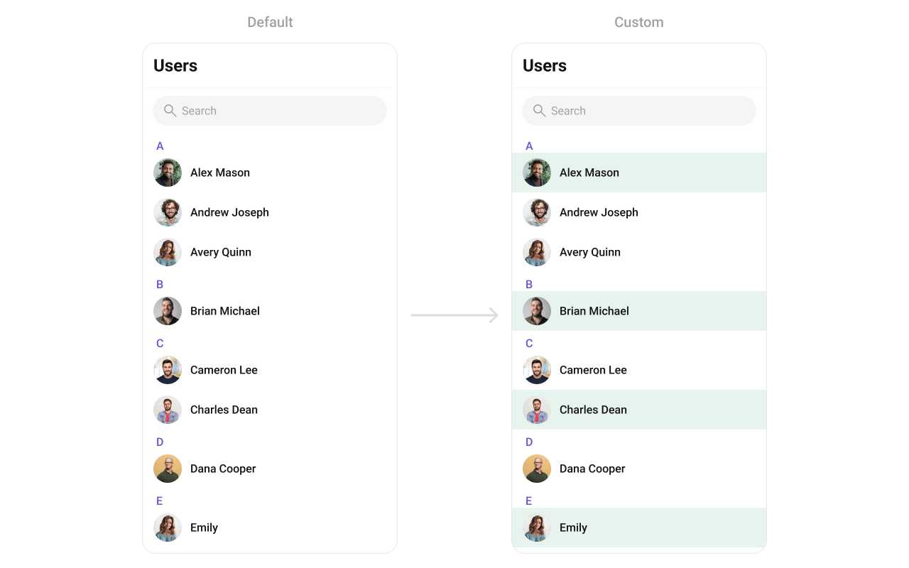
background: user.status == CometChatUserStatus.online
? const Color(0xFFE6F4ED)
: Colors.transparent,
titleStyle: TextStyle(
overflow: TextOverflow.ellipsis,
fontSize: 16,
fontWeight: FontWeight.w500,
color: Color(0xFF141414),
),
padding: EdgeInsets.only(left: 16, right: 16, top: 8, bottom: 8),
),
);
}
// Usage:
CometChatUsers(
listItemView: (user) => getCustomUserListItem(user, context),
)
```
### leadingView
Replace the avatar / left section.
```dart theme={null}
CometChatUsers(
leadingView: (context, user) {
return Container(
decoration: BoxDecoration(
border: Border.all(
color: user.status == CometChatUserStatus.online
? Color(0xFF09C26F)
: Colors.transparent,
width: 2,
),
borderRadius: BorderRadius.circular(8),
),
child: CometChatAvatar(
image: user.avatar,
name: user.name,
style: CometChatAvatarStyle(
borderRadius: BorderRadius.circular(6),
),
),
);
},
)
```
### titleView
Replace the name / title text. Role badge inline example.
```dart theme={null}
CometChatUsers(
titleView: (context, user) {
return Row(
children: [
Text(
user.name ?? "",
style: TextStyle(fontWeight: FontWeight.w500, fontSize: 16),
),
if (user.role != null)
Container(
margin: EdgeInsets.only(left: 4),
padding: EdgeInsets.symmetric(horizontal: 6, vertical: 2),
decoration: BoxDecoration(
color: Color(0xFF09C26F),
borderRadius: BorderRadius.circular(7),
),
child: Text(
user.role!,
style: TextStyle(color: Colors.white, fontSize: 8, fontWeight: FontWeight.w600),
),
),
],
);
},
)
```
### subtitleView
Replace the subtitle text for each user.
```dart theme={null}
Widget getCustomUserListItem(User user, BuildContext context) {
// Get status indicator
StatusIndicatorUtils statusIndicatorUtils = StatusIndicatorUtils.getStatusIndicatorFromParams(
context: context,
user: user,
onlineStatusIndicatorColor: Color(0xFF56E8A7),
);
return CometChatListItem(
id: user.uid,
avatarName: user.name,
avatarURL: user.avatar,
avatarHeight: 40,
avatarWidth: 40,
title: user.name,
key: UniqueKey(),
statusIndicatorColor: statusIndicatorUtils.statusIndicatorColor,
statusIndicatorIcon: statusIndicatorUtils.icon,
statusIndicatorStyle: CometChatStatusIndicatorStyle(
border: Border.all(width: 2, color: Color(0xFFFFFFFF)),
backgroundColor: Color(0xFF56E8A7),
),
hideSeparator: true,
style: ListItemStyle(
background: user.status == CometChatUserStatus.online
? const Color(0xFFE6F4ED)
: Colors.transparent,
titleStyle: TextStyle(
overflow: TextOverflow.ellipsis,
fontSize: 16,
fontWeight: FontWeight.w500,
color: Color(0xFF141414),
),
padding: EdgeInsets.only(left: 16, right: 16, top: 8, bottom: 8),
),
);
}
// Usage:
CometChatUsers(
listItemView: (user) => getCustomUserListItem(user, context),
)
```
### leadingView
Replace the avatar / left section.
```dart theme={null}
CometChatUsers(
leadingView: (context, user) {
return Container(
decoration: BoxDecoration(
border: Border.all(
color: user.status == CometChatUserStatus.online
? Color(0xFF09C26F)
: Colors.transparent,
width: 2,
),
borderRadius: BorderRadius.circular(8),
),
child: CometChatAvatar(
image: user.avatar,
name: user.name,
style: CometChatAvatarStyle(
borderRadius: BorderRadius.circular(6),
),
),
);
},
)
```
### titleView
Replace the name / title text. Role badge inline example.
```dart theme={null}
CometChatUsers(
titleView: (context, user) {
return Row(
children: [
Text(
user.name ?? "",
style: TextStyle(fontWeight: FontWeight.w500, fontSize: 16),
),
if (user.role != null)
Container(
margin: EdgeInsets.only(left: 4),
padding: EdgeInsets.symmetric(horizontal: 6, vertical: 2),
decoration: BoxDecoration(
color: Color(0xFF09C26F),
borderRadius: BorderRadius.circular(7),
),
child: Text(
user.role!,
style: TextStyle(color: Colors.white, fontSize: 8, fontWeight: FontWeight.w600),
),
),
],
);
},
)
```
### subtitleView
Replace the subtitle text for each user.
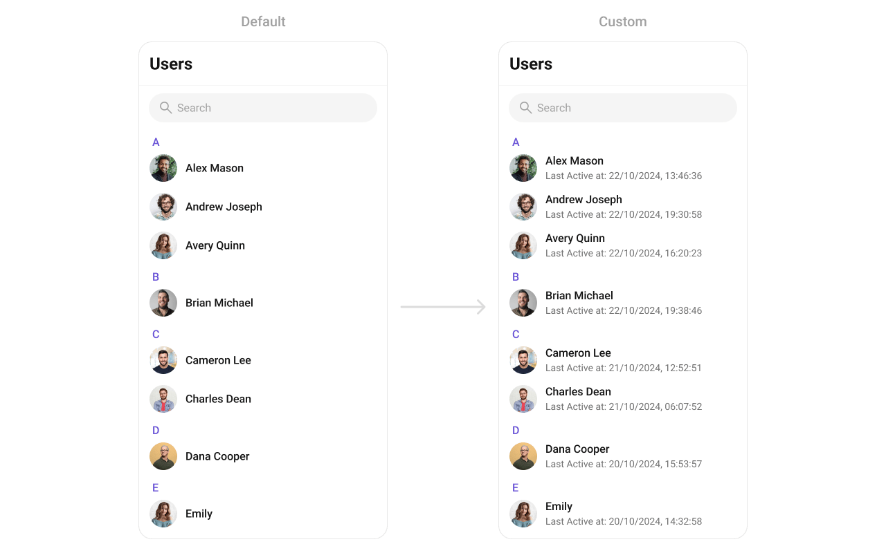 ```dart theme={null}
CometChatUsers(
subtitleView: (context, user) {
final dateTime = user.lastActiveAt ?? DateTime.now();
final subtitle = "Last Active at ${DateFormat('dd/MM/yyyy, HH:mm:ss').format(dateTime)}";
return Text(
subtitle,
style: TextStyle(
color: Color(0xFF727272),
fontSize: 14,
fontWeight: FontWeight.w400,
),
);
},
)
```
### trailingView
Replace the right section. Custom tag badge example.
```dart theme={null}
CometChatUsers(
trailingView: (context, user) {
final tag = user.tags?.isNotEmpty == true ? user.tags!.first : null;
if (tag == null) return null;
return Container(
padding: EdgeInsets.symmetric(horizontal: 6, vertical: 4),
decoration: BoxDecoration(
color: Color(0xFF6852D6),
borderRadius: BorderRadius.circular(4),
),
child: Text(
tag,
style: TextStyle(color: Colors.white, fontSize: 10, fontWeight: FontWeight.w600),
),
);
},
)
```
### setOptions
Replace the context menu / long-press actions on each user item.
```dart theme={null}
CometChatUsers(
setOptions: (user, controller, context) {
return [
CometChatOption(
id: "block",
title: "Block User",
icon: AssetConstants.close,
onClick: () {
CometChat.blockUsers([user.uid], onSuccess: (users) {
print("User blocked");
}, onError: (error) {
print("Error: $error");
});
},
),
CometChatOption(
id: "view_profile",
title: "View Profile",
iconWidget: Icon(Icons.person_outline),
onClick: () {
// Navigate to user profile
},
),
];
},
)
```
### addOptions
Add to the existing context menu actions without removing defaults.
```dart theme={null}
CometChatUsers(
addOptions: (user, controller, context) {
return [
CometChatOption(
id: "add_friend",
title: "Add Friend",
iconWidget: Icon(Icons.person_add_outlined),
onClick: () {
// Add friend logic
},
),
CometChatOption(
id: "send_message",
title: "Send Message",
iconWidget: Icon(Icons.message_outlined),
onClick: () {
// Navigate to messages
},
),
];
},
)
```
### appBarOptions
Add custom widgets to the app bar.
```dart theme={null}
CometChatUsers(
subtitleView: (context, user) {
final dateTime = user.lastActiveAt ?? DateTime.now();
final subtitle = "Last Active at ${DateFormat('dd/MM/yyyy, HH:mm:ss').format(dateTime)}";
return Text(
subtitle,
style: TextStyle(
color: Color(0xFF727272),
fontSize: 14,
fontWeight: FontWeight.w400,
),
);
},
)
```
### trailingView
Replace the right section. Custom tag badge example.
```dart theme={null}
CometChatUsers(
trailingView: (context, user) {
final tag = user.tags?.isNotEmpty == true ? user.tags!.first : null;
if (tag == null) return null;
return Container(
padding: EdgeInsets.symmetric(horizontal: 6, vertical: 4),
decoration: BoxDecoration(
color: Color(0xFF6852D6),
borderRadius: BorderRadius.circular(4),
),
child: Text(
tag,
style: TextStyle(color: Colors.white, fontSize: 10, fontWeight: FontWeight.w600),
),
);
},
)
```
### setOptions
Replace the context menu / long-press actions on each user item.
```dart theme={null}
CometChatUsers(
setOptions: (user, controller, context) {
return [
CometChatOption(
id: "block",
title: "Block User",
icon: AssetConstants.close,
onClick: () {
CometChat.blockUsers([user.uid], onSuccess: (users) {
print("User blocked");
}, onError: (error) {
print("Error: $error");
});
},
),
CometChatOption(
id: "view_profile",
title: "View Profile",
iconWidget: Icon(Icons.person_outline),
onClick: () {
// Navigate to user profile
},
),
];
},
)
```
### addOptions
Add to the existing context menu actions without removing defaults.
```dart theme={null}
CometChatUsers(
addOptions: (user, controller, context) {
return [
CometChatOption(
id: "add_friend",
title: "Add Friend",
iconWidget: Icon(Icons.person_add_outlined),
onClick: () {
// Add friend logic
},
),
CometChatOption(
id: "send_message",
title: "Send Message",
iconWidget: Icon(Icons.message_outlined),
onClick: () {
// Navigate to messages
},
),
];
},
)
```
### appBarOptions
Add custom widgets to the app bar.
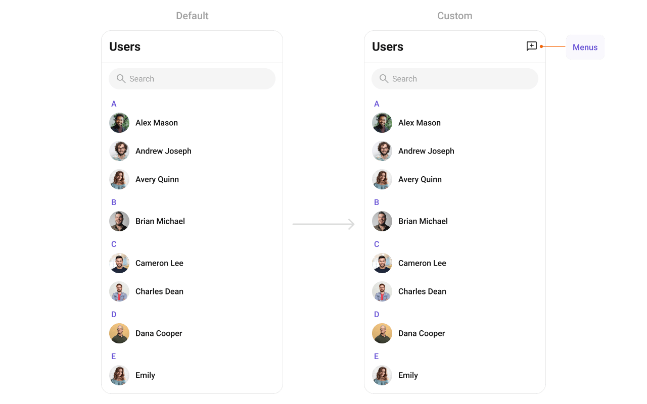 ```dart theme={null}
CometChatUsers(
appBarOptions: (context) => [
IconButton(
onPressed: () {
// Handle action
},
icon: Icon(Icons.add_comment_outlined, color: Color(0xFF141414)),
),
],
)
```
For a more complete popup menu with styling:
```dart theme={null}
CometChatUsers(
appBarOptions: (context) => [
PopupMenuButton(
shape: RoundedRectangleBorder(
borderRadius: BorderRadius.circular(8),
side: BorderSide(color: Color(0xFFF5F5F5), width: 1),
),
color: Colors.white,
elevation: 4,
icon: Icon(Icons.more_vert, color: Color(0xFF141414)),
onSelected: (value) {
switch (value) {
case 'refresh':
// Refresh users list
break;
case 'settings':
// Navigate to settings
break;
}
},
itemBuilder: (BuildContext context) => [
PopupMenuItem(
value: 'refresh',
child: Row(
children: [
Icon(Icons.refresh, color: Color(0xFFA1A1A1)),
SizedBox(width: 8),
Text("Refresh"),
],
),
),
PopupMenuItem(
value: 'settings',
child: Row(
children: [
Icon(Icons.settings, color: Color(0xFFA1A1A1)),
SizedBox(width: 8),
Text("Settings"),
],
),
),
],
),
],
)
```
***
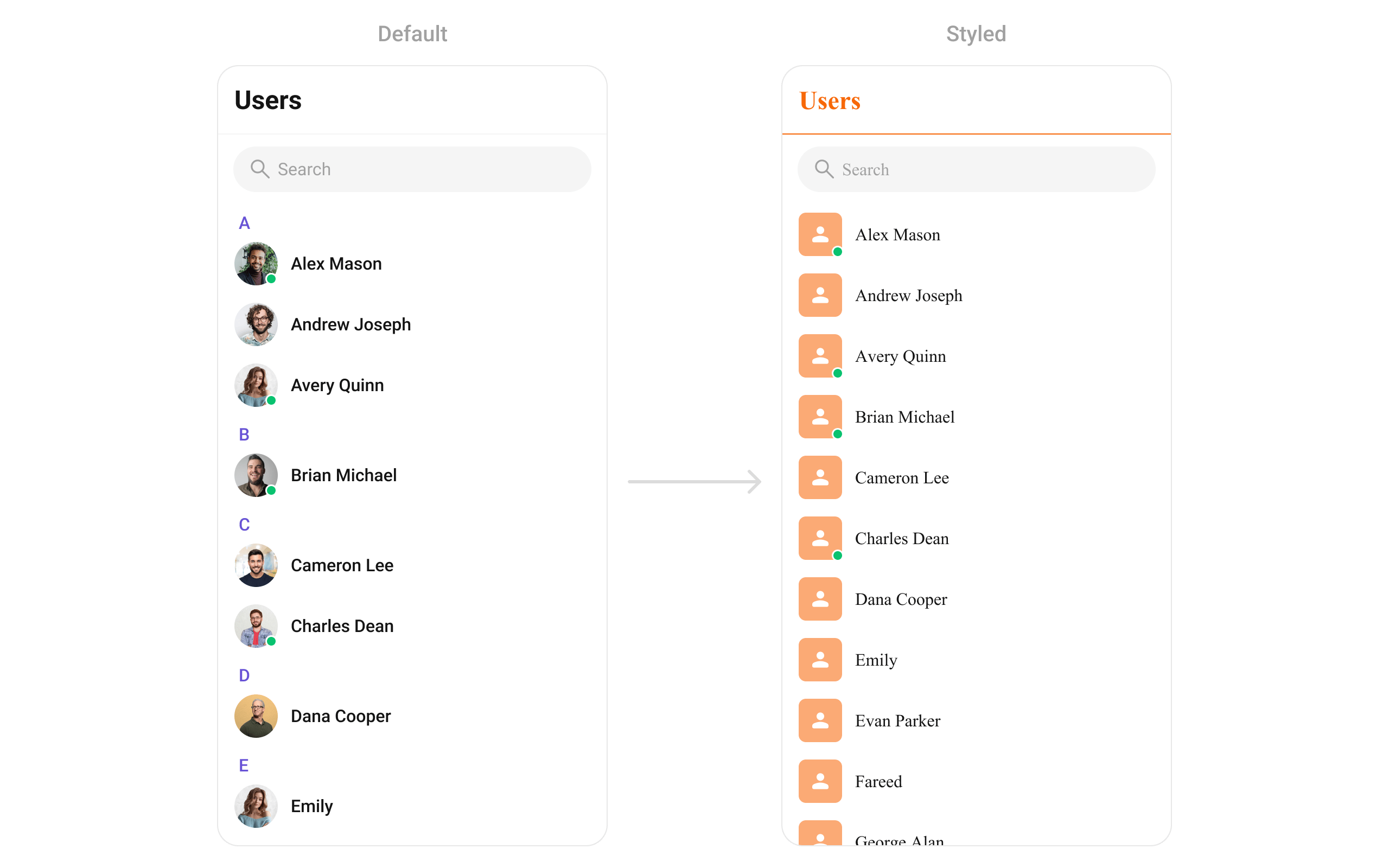
## Styling
Set `CometChatUsersStyle` to customize the appearance.
```dart theme={null}
CometChatUsers(
usersStyle: CometChatUsersStyle(
backgroundColor: Colors.white,
titleTextColor: Color(0xFFF76808),
separatorColor: Color(0xFFF76808),
avatarStyle: CometChatAvatarStyle(
borderRadius: BorderRadius.circular(8),
backgroundColor: Color(0xFFFBAA75),
),
),
)
```
```dart theme={null}
CometChatUsers(
appBarOptions: (context) => [
IconButton(
onPressed: () {
// Handle action
},
icon: Icon(Icons.add_comment_outlined, color: Color(0xFF141414)),
),
],
)
```
For a more complete popup menu with styling:
```dart theme={null}
CometChatUsers(
appBarOptions: (context) => [
PopupMenuButton(
shape: RoundedRectangleBorder(
borderRadius: BorderRadius.circular(8),
side: BorderSide(color: Color(0xFFF5F5F5), width: 1),
),
color: Colors.white,
elevation: 4,
icon: Icon(Icons.more_vert, color: Color(0xFF141414)),
onSelected: (value) {
switch (value) {
case 'refresh':
// Refresh users list
break;
case 'settings':
// Navigate to settings
break;
}
},
itemBuilder: (BuildContext context) => [
PopupMenuItem(
value: 'refresh',
child: Row(
children: [
Icon(Icons.refresh, color: Color(0xFFA1A1A1)),
SizedBox(width: 8),
Text("Refresh"),
],
),
),
PopupMenuItem(
value: 'settings',
child: Row(
children: [
Icon(Icons.settings, color: Color(0xFFA1A1A1)),
SizedBox(width: 8),
Text("Settings"),
],
),
),
],
),
],
)
```
***
## Styling
Set `CometChatUsersStyle` to customize the appearance.
```dart theme={null}
CometChatUsers(
usersStyle: CometChatUsersStyle(
backgroundColor: Colors.white,
titleTextColor: Color(0xFFF76808),
separatorColor: Color(0xFFF76808),
avatarStyle: CometChatAvatarStyle(
borderRadius: BorderRadius.circular(8),
backgroundColor: Color(0xFFFBAA75),
),
),
)
```
 ### Style Properties
| Property | Type | Description |
| --------------------------------- | -------------------------------- | -------------------------------------- |
| `backgroundColor` | `Color?` | Background color of the component |
| `border` | `Border?` | Border for the widget |
| `borderRadius` | `BorderRadiusGeometry?` | Border radius for the widget |
| `titleTextColor` | `Color?` | Color of the header title |
| `titleTextStyle` | `TextStyle?` | Style for the header title |
| `backIconColor` | `Color?` | Back button icon color |
| `searchBackgroundColor` | `Color?` | Background color of search box |
| `searchBorder` | `BorderSide?` | Border for search box |
| `searchBorderRadius` | `BorderRadius?` | Border radius for search box |
| `searchPlaceHolderTextColor` | `Color?` | Placeholder text color in search |
| `searchPlaceHolderTextStyle` | `TextStyle?` | Placeholder text style in search |
| `searchIconColor` | `Color?` | Search icon color |
| `searchInputTextColor` | `Color?` | Search input text color |
| `searchInputTextStyle` | `TextStyle?` | Search input text style |
| `separatorColor` | `Color?` | Color of list item separators |
| `separatorHeight` | `double?` | Height of list item separators |
| `stickyTitleColor` | `Color?` | Color of sticky alphabetical headers |
| `stickyTitleTextStyle` | `TextStyle?` | Style for sticky alphabetical headers |
| `itemTitleTextColor` | `Color?` | Color of user name in list items |
| `itemTitleTextStyle` | `TextStyle?` | Style for user name in list items |
| `itemBorder` | `BoxBorder?` | Border for list items |
| `listItemSelectedBackgroundColor` | `Color?` | Background color for selected items |
| `emptyStateTextColor` | `Color?` | Text color for empty state title |
| `emptyStateTextStyle` | `TextStyle?` | Text style for empty state title |
| `emptyStateSubTitleTextColor` | `Color?` | Text color for empty state subtitle |
| `emptyStateSubTitleTextStyle` | `TextStyle?` | Text style for empty state subtitle |
| `errorStateTextColor` | `Color?` | Text color for error state title |
| `errorStateTextStyle` | `TextStyle?` | Text style for error state title |
| `errorStateSubTitleTextColor` | `Color?` | Text color for error state subtitle |
| `errorStateSubTitleTextStyle` | `TextStyle?` | Text style for error state subtitle |
| `retryButtonBackgroundColor` | `Color?` | Background color for retry button |
| `retryButtonBorderRadius` | `BorderRadiusGeometry?` | Border radius for retry button |
| `retryButtonBorder` | `BorderSide?` | Border for retry button |
| `retryButtonTextColor` | `Color?` | Text color for retry button |
| `retryButtonTextStyle` | `TextStyle?` | Text style for retry button |
| `submitIconColor` | `Color?` | Color of submit icon in selection mode |
| `checkBoxBackgroundColor` | `Color?` | Background color of unchecked checkbox |
| `checkBoxCheckedBackgroundColor` | `Color?` | Background color of checked checkbox |
| `checkboxSelectedIconColor` | `Color?` | Color of checkmark icon |
| `checkBoxBorderRadius` | `BorderRadiusGeometry?` | Border radius for checkbox |
| `checkBoxBorder` | `BorderSide?` | Border for checkbox |
| `avatarStyle` | `CometChatAvatarStyle?` | Style for user avatars |
| `statusIndicatorStyle` | `CometChatStatusIndicatorStyle?` | Style for status indicators |
***
## Common Patterns
### Custom empty state with CTA
```dart theme={null}
CometChatUsers(
emptyStateView: (context) {
return Center(
child: Column(
mainAxisAlignment: MainAxisAlignment.center,
children: [
Icon(Icons.people_outline, size: 64, color: Color(0xFF727272)),
SizedBox(height: 16),
Text("No users found", style: TextStyle(fontSize: 18, fontWeight: FontWeight.w500)),
SizedBox(height: 8),
ElevatedButton(
onPressed: () {
// Invite users
},
child: Text("Invite Users"),
),
],
),
);
},
)
```
### Friends-only list
```dart theme={null}
CometChatUsers(
usersRequestBuilder: UsersRequestBuilder()
..friendsOnly = true
..limit = 15,
)
```
### Multi-select with selection callback
```dart theme={null}
CometChatUsers(
selectionMode: SelectionMode.multiple,
activateSelection: ActivateSelection.onClick,
onSelection: (selectedUsers, context) {
if (selectedUsers != null && selectedUsers.isNotEmpty) {
print("Selected ${selectedUsers.length} users");
// Create group with selected users, etc.
}
},
)
```
### Hide all chrome — minimal list
```dart theme={null}
CometChatUsers(
hideSearch: true,
hideAppbar: true,
usersStatusVisibility: false,
stickyHeaderVisibility: true, // hides alphabetical headers
)
```
### Online users only
```dart theme={null}
CometChatUsers(
usersRequestBuilder: UsersRequestBuilder()
..userStatus = CometChatUserStatus.online,
)
```
***
## Accessibility
The component renders a scrollable list of interactive items. Each user row supports:
* Tap gesture for selection/navigation
* Long-press gesture for context menu actions
* Checkbox selection in multi-select mode with proper touch targets
* Status indicators with visual feedback for online/offline state
For screen readers:
* User names are readable as list item titles
* Status indicators use color coding — consider adding `Semantics` widgets via `leadingView` if screen reader descriptions are needed for these visual indicators
* Selection state is communicated through checkbox widgets
The component respects system accessibility settings including text scaling and high contrast modes.
***
## Props
All props are optional unless noted.
### activateSelection
Controls when selection mode activates.
| | |
| ------- | -------------------- |
| Type | `ActivateSelection?` |
| Default | `null` |
Values: `ActivateSelection.onClick`, `ActivateSelection.onLongClick`
***
### addOptions
Adds additional context menu actions to the default options.
| | |
| ------- | -------------------------------------------------------------------------------- |
| Type | `List? Function(User, CometChatUsersController, BuildContext)?` |
| Default | `null` |
***
### appBarOptions
Custom widgets to display in the app bar.
| | |
| ------- | ---------------------------------------------- |
| Type | `List Function(BuildContext context)?` |
| Default | `null` |
***
### backButton
Custom back button widget.
| | |
| ------- | ------------------- |
| Type | `Widget?` |
| Default | Built-in back arrow |
***
### controllerTag
Identifier tag for controller management.
| | |
| ------- | --------- |
| Type | `String?` |
| Default | `null` |
***
### emptyStateView
Custom view displayed when there are no users.
| | |
| ------- | -------------------- |
| Type | `WidgetBuilder?` |
| Default | Built-in empty state |
***
### errorStateView
Custom view displayed when an error occurs.
| | |
| ------- | -------------------- |
| Type | `WidgetBuilder?` |
| Default | Built-in error state |
***
### height
Height of the widget.
| | |
| ------- | --------- |
| Type | `double?` |
| Default | `null` |
***
### hideAppbar
Hides the app bar including title and search.
| | |
| ------- | ------- |
| Type | `bool?` |
| Default | `false` |
***
### hideSearch
Hides the search input box.
| | |
| ------- | ------- |
| Type | `bool` |
| Default | `false` |
***
### leadingView
Custom renderer for the avatar / left section.
| | |
| ------- | ---------------------------------------------------- |
| Type | `Widget? Function(BuildContext context, User user)?` |
| Default | Built-in avatar |
***
### listItemView
Custom renderer for the entire list item row.
| | |
| ------- | ----------------------------- |
| Type | `Widget Function(User user)?` |
| Default | Built-in list item |
***
### loadingStateView
Custom view displayed during loading state.
| | |
| ------- | ---------------- |
| Type | `WidgetBuilder?` |
| Default | Built-in shimmer |
***
### onBack
Callback triggered when the back button is pressed.
| | |
| ------- | --------------- |
| Type | `VoidCallback?` |
| Default | `null` |
***
### onEmpty
Callback triggered when the user list is empty.
| | |
| ------- | ---------- |
| Type | `OnEmpty?` |
| Default | `null` |
***
### onError
Callback triggered when an error occurs.
| | |
| ------- | ---------- |
| Type | `OnError?` |
| Default | `null` |
***
### onItemLongPress
Callback triggered on long press of a user item.
| | |
| ------- | -------------------------------------------- |
| Type | `Function(BuildContext context, User user)?` |
| Default | `null` |
***
### onItemTap
Callback triggered when tapping a user item.
| | |
| ------- | -------------------------------------------- |
| Type | `Function(BuildContext context, User user)?` |
| Default | `null` |
***
### onLoad
Callback triggered when the list is successfully loaded.
| | |
| ------- | --------------- |
| Type | `OnLoad?` |
| Default | `null` |
***
### onSelection
Callback triggered when users are selected. Requires `selectionMode` to be set.
| | |
| ------- | --------------------------------------------------- |
| Type | `Function(List? list, BuildContext context)?` |
| Default | `null` |
***
### scrollController
Controller for scrolling the list.
| | |
| ------- | ------------------- |
| Type | `ScrollController?` |
| Default | `null` |
***
### searchBoxIcon
Custom search box icon widget.
| | |
| ------- | -------------------- |
| Type | `Widget?` |
| Default | Built-in search icon |
***
### searchKeyword
Pre-fills the search and filters the user list.
| | |
| ------- | --------- |
| Type | `String?` |
| Default | `null` |
***
### searchPlaceholder
Placeholder text for the search input box.
| | |
| ------- | --------- |
| Type | `String?` |
| Default | `null` |
***
### selectionMode
Enables single or multi-select mode.
| | |
| ------- | ---------------- |
| Type | `SelectionMode?` |
| Default | `null` |
Values: `SelectionMode.single`, `SelectionMode.multiple`, `SelectionMode.none`
***
### setOptions
Replaces the default context menu actions.
| | |
| ------- | -------------------------------------------------------------------------------- |
| Type | `List? Function(User, CometChatUsersController, BuildContext)?` |
| Default | `null` |
***
### showBackButton
Shows or hides the back button.
| | |
| ------- | ------ |
| Type | `bool` |
| Default | `true` |
***
### stickyHeaderVisibility
Hides alphabetical section headers when set to `true`.
| | |
| ------- | ------- |
| Type | `bool?` |
| Default | `false` |
Note: When `false`, alphabetical headers (A, B, C...) are shown to separate users.
***
### submitIcon
Custom submit icon widget for selection mode.
| | |
| ------- | ------------------- |
| Type | `Widget?` |
| Default | Built-in check icon |
***
### subtitleView
Custom renderer for the subtitle text.
| | |
| ------- | ---------------------------------------------------- |
| Type | `Widget? Function(BuildContext context, User user)?` |
| Default | `null` |
***
### title
Title text displayed in the app bar.
| | |
| ------- | --------- |
| Type | `String?` |
| Default | `"Users"` |
***
### titleView
Custom renderer for the name / title text.
| | |
| ------- | ---------------------------------------------------- |
| Type | `Widget? Function(BuildContext context, User user)?` |
| Default | Built-in title |
***
### trailingView
Custom renderer for the right section.
| | |
| ------- | ---------------------------------------------------- |
| Type | `Widget? Function(BuildContext context, User user)?` |
| Default | `null` |
***
### usersProtocol
Custom protocol for fetching users.
| | |
| ------- | ----------------------- |
| Type | `UsersBuilderProtocol?` |
| Default | `null` |
***
### usersRequestBuilder
Controls which users load and in what order.
| | |
| ------- | ------------------------- |
| Type | `UsersRequestBuilder?` |
| Default | SDK default (30 per page) |
Pass the builder instance, not the result of `.build()`.
***
### usersStatusVisibility
Shows or hides the online/offline status indicator on user avatars.
| | |
| ------- | ------- |
| Type | `bool?` |
| Default | `true` |
***
### usersStyle
Styling options for the users list.
| | |
| ------- | ----------------------- |
| Type | `CometChatUsersStyle` |
| Default | `CometChatUsersStyle()` |
***
### width
Width of the widget.
| | |
| ------- | --------- |
| Type | `double?` |
| Default | `null` |
***
## Events
`CometChatUsers` does not emit custom UI events. It subscribes to:
| Event | Payload | Internal behavior |
| ------------------------------------- | ------- | ------------------------------ |
| `CometChatUserEvents.ccUserBlocked` | `User` | Updates blocked user in list |
| `CometChatUserEvents.ccUserUnblocked` | `User` | Updates unblocked user in list |
***
## Customization Matrix
| What to change | Where | Property/API | Example |
| ------------------------------------- | --------------- | ----------------------------------------------- | ---------------------------------------------------------------- |
| Override behavior on user interaction | Component props | `on` callbacks | `onItemTap: (ctx, user) => setActive(user)` |
| Filter which users appear | Component props | `usersRequestBuilder` | `usersRequestBuilder: UsersRequestBuilder()..friendsOnly = true` |
| Toggle visibility of UI elements | Component props | `hide` / `show` boolean props | `hideSearch: true` |
| Replace a section of the list item | Component props | `View` render props | `listItemView: (user) => CustomWidget()` |
| Change colors, fonts, spacing | Component props | `usersStyle` | `usersStyle: CometChatUsersStyle(titleTextColor: Colors.red)` |
***
Display recent one-on-one and group conversations
Display and manage group chats
Display messages in a conversation
Learn how to customize the look and feel
### Style Properties
| Property | Type | Description |
| --------------------------------- | -------------------------------- | -------------------------------------- |
| `backgroundColor` | `Color?` | Background color of the component |
| `border` | `Border?` | Border for the widget |
| `borderRadius` | `BorderRadiusGeometry?` | Border radius for the widget |
| `titleTextColor` | `Color?` | Color of the header title |
| `titleTextStyle` | `TextStyle?` | Style for the header title |
| `backIconColor` | `Color?` | Back button icon color |
| `searchBackgroundColor` | `Color?` | Background color of search box |
| `searchBorder` | `BorderSide?` | Border for search box |
| `searchBorderRadius` | `BorderRadius?` | Border radius for search box |
| `searchPlaceHolderTextColor` | `Color?` | Placeholder text color in search |
| `searchPlaceHolderTextStyle` | `TextStyle?` | Placeholder text style in search |
| `searchIconColor` | `Color?` | Search icon color |
| `searchInputTextColor` | `Color?` | Search input text color |
| `searchInputTextStyle` | `TextStyle?` | Search input text style |
| `separatorColor` | `Color?` | Color of list item separators |
| `separatorHeight` | `double?` | Height of list item separators |
| `stickyTitleColor` | `Color?` | Color of sticky alphabetical headers |
| `stickyTitleTextStyle` | `TextStyle?` | Style for sticky alphabetical headers |
| `itemTitleTextColor` | `Color?` | Color of user name in list items |
| `itemTitleTextStyle` | `TextStyle?` | Style for user name in list items |
| `itemBorder` | `BoxBorder?` | Border for list items |
| `listItemSelectedBackgroundColor` | `Color?` | Background color for selected items |
| `emptyStateTextColor` | `Color?` | Text color for empty state title |
| `emptyStateTextStyle` | `TextStyle?` | Text style for empty state title |
| `emptyStateSubTitleTextColor` | `Color?` | Text color for empty state subtitle |
| `emptyStateSubTitleTextStyle` | `TextStyle?` | Text style for empty state subtitle |
| `errorStateTextColor` | `Color?` | Text color for error state title |
| `errorStateTextStyle` | `TextStyle?` | Text style for error state title |
| `errorStateSubTitleTextColor` | `Color?` | Text color for error state subtitle |
| `errorStateSubTitleTextStyle` | `TextStyle?` | Text style for error state subtitle |
| `retryButtonBackgroundColor` | `Color?` | Background color for retry button |
| `retryButtonBorderRadius` | `BorderRadiusGeometry?` | Border radius for retry button |
| `retryButtonBorder` | `BorderSide?` | Border for retry button |
| `retryButtonTextColor` | `Color?` | Text color for retry button |
| `retryButtonTextStyle` | `TextStyle?` | Text style for retry button |
| `submitIconColor` | `Color?` | Color of submit icon in selection mode |
| `checkBoxBackgroundColor` | `Color?` | Background color of unchecked checkbox |
| `checkBoxCheckedBackgroundColor` | `Color?` | Background color of checked checkbox |
| `checkboxSelectedIconColor` | `Color?` | Color of checkmark icon |
| `checkBoxBorderRadius` | `BorderRadiusGeometry?` | Border radius for checkbox |
| `checkBoxBorder` | `BorderSide?` | Border for checkbox |
| `avatarStyle` | `CometChatAvatarStyle?` | Style for user avatars |
| `statusIndicatorStyle` | `CometChatStatusIndicatorStyle?` | Style for status indicators |
***
## Common Patterns
### Custom empty state with CTA
```dart theme={null}
CometChatUsers(
emptyStateView: (context) {
return Center(
child: Column(
mainAxisAlignment: MainAxisAlignment.center,
children: [
Icon(Icons.people_outline, size: 64, color: Color(0xFF727272)),
SizedBox(height: 16),
Text("No users found", style: TextStyle(fontSize: 18, fontWeight: FontWeight.w500)),
SizedBox(height: 8),
ElevatedButton(
onPressed: () {
// Invite users
},
child: Text("Invite Users"),
),
],
),
);
},
)
```
### Friends-only list
```dart theme={null}
CometChatUsers(
usersRequestBuilder: UsersRequestBuilder()
..friendsOnly = true
..limit = 15,
)
```
### Multi-select with selection callback
```dart theme={null}
CometChatUsers(
selectionMode: SelectionMode.multiple,
activateSelection: ActivateSelection.onClick,
onSelection: (selectedUsers, context) {
if (selectedUsers != null && selectedUsers.isNotEmpty) {
print("Selected ${selectedUsers.length} users");
// Create group with selected users, etc.
}
},
)
```
### Hide all chrome — minimal list
```dart theme={null}
CometChatUsers(
hideSearch: true,
hideAppbar: true,
usersStatusVisibility: false,
stickyHeaderVisibility: true, // hides alphabetical headers
)
```
### Online users only
```dart theme={null}
CometChatUsers(
usersRequestBuilder: UsersRequestBuilder()
..userStatus = CometChatUserStatus.online,
)
```
***
## Accessibility
The component renders a scrollable list of interactive items. Each user row supports:
* Tap gesture for selection/navigation
* Long-press gesture for context menu actions
* Checkbox selection in multi-select mode with proper touch targets
* Status indicators with visual feedback for online/offline state
For screen readers:
* User names are readable as list item titles
* Status indicators use color coding — consider adding `Semantics` widgets via `leadingView` if screen reader descriptions are needed for these visual indicators
* Selection state is communicated through checkbox widgets
The component respects system accessibility settings including text scaling and high contrast modes.
***
## Props
All props are optional unless noted.
### activateSelection
Controls when selection mode activates.
| | |
| ------- | -------------------- |
| Type | `ActivateSelection?` |
| Default | `null` |
Values: `ActivateSelection.onClick`, `ActivateSelection.onLongClick`
***
### addOptions
Adds additional context menu actions to the default options.
| | |
| ------- | -------------------------------------------------------------------------------- |
| Type | `List? Function(User, CometChatUsersController, BuildContext)?` |
| Default | `null` |
***
### appBarOptions
Custom widgets to display in the app bar.
| | |
| ------- | ---------------------------------------------- |
| Type | `List Function(BuildContext context)?` |
| Default | `null` |
***
### backButton
Custom back button widget.
| | |
| ------- | ------------------- |
| Type | `Widget?` |
| Default | Built-in back arrow |
***
### controllerTag
Identifier tag for controller management.
| | |
| ------- | --------- |
| Type | `String?` |
| Default | `null` |
***
### emptyStateView
Custom view displayed when there are no users.
| | |
| ------- | -------------------- |
| Type | `WidgetBuilder?` |
| Default | Built-in empty state |
***
### errorStateView
Custom view displayed when an error occurs.
| | |
| ------- | -------------------- |
| Type | `WidgetBuilder?` |
| Default | Built-in error state |
***
### height
Height of the widget.
| | |
| ------- | --------- |
| Type | `double?` |
| Default | `null` |
***
### hideAppbar
Hides the app bar including title and search.
| | |
| ------- | ------- |
| Type | `bool?` |
| Default | `false` |
***
### hideSearch
Hides the search input box.
| | |
| ------- | ------- |
| Type | `bool` |
| Default | `false` |
***
### leadingView
Custom renderer for the avatar / left section.
| | |
| ------- | ---------------------------------------------------- |
| Type | `Widget? Function(BuildContext context, User user)?` |
| Default | Built-in avatar |
***
### listItemView
Custom renderer for the entire list item row.
| | |
| ------- | ----------------------------- |
| Type | `Widget Function(User user)?` |
| Default | Built-in list item |
***
### loadingStateView
Custom view displayed during loading state.
| | |
| ------- | ---------------- |
| Type | `WidgetBuilder?` |
| Default | Built-in shimmer |
***
### onBack
Callback triggered when the back button is pressed.
| | |
| ------- | --------------- |
| Type | `VoidCallback?` |
| Default | `null` |
***
### onEmpty
Callback triggered when the user list is empty.
| | |
| ------- | ---------- |
| Type | `OnEmpty?` |
| Default | `null` |
***
### onError
Callback triggered when an error occurs.
| | |
| ------- | ---------- |
| Type | `OnError?` |
| Default | `null` |
***
### onItemLongPress
Callback triggered on long press of a user item.
| | |
| ------- | -------------------------------------------- |
| Type | `Function(BuildContext context, User user)?` |
| Default | `null` |
***
### onItemTap
Callback triggered when tapping a user item.
| | |
| ------- | -------------------------------------------- |
| Type | `Function(BuildContext context, User user)?` |
| Default | `null` |
***
### onLoad
Callback triggered when the list is successfully loaded.
| | |
| ------- | --------------- |
| Type | `OnLoad?` |
| Default | `null` |
***
### onSelection
Callback triggered when users are selected. Requires `selectionMode` to be set.
| | |
| ------- | --------------------------------------------------- |
| Type | `Function(List? list, BuildContext context)?` |
| Default | `null` |
***
### scrollController
Controller for scrolling the list.
| | |
| ------- | ------------------- |
| Type | `ScrollController?` |
| Default | `null` |
***
### searchBoxIcon
Custom search box icon widget.
| | |
| ------- | -------------------- |
| Type | `Widget?` |
| Default | Built-in search icon |
***
### searchKeyword
Pre-fills the search and filters the user list.
| | |
| ------- | --------- |
| Type | `String?` |
| Default | `null` |
***
### searchPlaceholder
Placeholder text for the search input box.
| | |
| ------- | --------- |
| Type | `String?` |
| Default | `null` |
***
### selectionMode
Enables single or multi-select mode.
| | |
| ------- | ---------------- |
| Type | `SelectionMode?` |
| Default | `null` |
Values: `SelectionMode.single`, `SelectionMode.multiple`, `SelectionMode.none`
***
### setOptions
Replaces the default context menu actions.
| | |
| ------- | -------------------------------------------------------------------------------- |
| Type | `List? Function(User, CometChatUsersController, BuildContext)?` |
| Default | `null` |
***
### showBackButton
Shows or hides the back button.
| | |
| ------- | ------ |
| Type | `bool` |
| Default | `true` |
***
### stickyHeaderVisibility
Hides alphabetical section headers when set to `true`.
| | |
| ------- | ------- |
| Type | `bool?` |
| Default | `false` |
Note: When `false`, alphabetical headers (A, B, C...) are shown to separate users.
***
### submitIcon
Custom submit icon widget for selection mode.
| | |
| ------- | ------------------- |
| Type | `Widget?` |
| Default | Built-in check icon |
***
### subtitleView
Custom renderer for the subtitle text.
| | |
| ------- | ---------------------------------------------------- |
| Type | `Widget? Function(BuildContext context, User user)?` |
| Default | `null` |
***
### title
Title text displayed in the app bar.
| | |
| ------- | --------- |
| Type | `String?` |
| Default | `"Users"` |
***
### titleView
Custom renderer for the name / title text.
| | |
| ------- | ---------------------------------------------------- |
| Type | `Widget? Function(BuildContext context, User user)?` |
| Default | Built-in title |
***
### trailingView
Custom renderer for the right section.
| | |
| ------- | ---------------------------------------------------- |
| Type | `Widget? Function(BuildContext context, User user)?` |
| Default | `null` |
***
### usersProtocol
Custom protocol for fetching users.
| | |
| ------- | ----------------------- |
| Type | `UsersBuilderProtocol?` |
| Default | `null` |
***
### usersRequestBuilder
Controls which users load and in what order.
| | |
| ------- | ------------------------- |
| Type | `UsersRequestBuilder?` |
| Default | SDK default (30 per page) |
Pass the builder instance, not the result of `.build()`.
***
### usersStatusVisibility
Shows or hides the online/offline status indicator on user avatars.
| | |
| ------- | ------- |
| Type | `bool?` |
| Default | `true` |
***
### usersStyle
Styling options for the users list.
| | |
| ------- | ----------------------- |
| Type | `CometChatUsersStyle` |
| Default | `CometChatUsersStyle()` |
***
### width
Width of the widget.
| | |
| ------- | --------- |
| Type | `double?` |
| Default | `null` |
***
## Events
`CometChatUsers` does not emit custom UI events. It subscribes to:
| Event | Payload | Internal behavior |
| ------------------------------------- | ------- | ------------------------------ |
| `CometChatUserEvents.ccUserBlocked` | `User` | Updates blocked user in list |
| `CometChatUserEvents.ccUserUnblocked` | `User` | Updates unblocked user in list |
***
## Customization Matrix
| What to change | Where | Property/API | Example |
| ------------------------------------- | --------------- | ----------------------------------------------- | ---------------------------------------------------------------- |
| Override behavior on user interaction | Component props | `on` callbacks | `onItemTap: (ctx, user) => setActive(user)` |
| Filter which users appear | Component props | `usersRequestBuilder` | `usersRequestBuilder: UsersRequestBuilder()..friendsOnly = true` |
| Toggle visibility of UI elements | Component props | `hide` / `show` boolean props | `hideSearch: true` |
| Replace a section of the list item | Component props | `View` render props | `listItemView: (user) => CustomWidget()` |
| Change colors, fonts, spacing | Component props | `usersStyle` | `usersStyle: CometChatUsersStyle(titleTextColor: Colors.red)` |
***
Display recent one-on-one and group conversations
Display and manage group chats
Display messages in a conversation
Learn how to customize the look and feel