> ## Documentation Index
> Fetch the complete documentation index at: https://cometchat-22654f5b-feature-card-builder.mintlify.site/llms.txt
> Use this file to discover all available pages before exploring further.
# Message Composer
> Message input area with send, attachment, voice note, sticker, and AI buttons. Supports text, media, mentions, and message editing.
`CometChatMessageComposer` renders the message input area and sends messages to the active conversation. It supports text, media, mentions, voice notes, stickers, and AI-powered features.
 ***
## Where It Fits
`CometChatMessageComposer` is an input component. Wire it with `CometChatMessageHeader` and `CometChatMessageList` to build a complete messaging layout.
```xml activity_chat.xml lines theme={null}
```
```kotlin lines theme={null}
val messageComposer = findViewById(R.id.message_composer)
messageComposer.setUser(user)
```
```kotlin lines theme={null}
CometChatMessageComposer(
user = user
)
```
***
## Quick Start
Add to your layout XML:
```xml lines theme={null}
```
Set a `User` or `Group`:
```kotlin lines theme={null}
override fun onCreate(savedInstanceState: Bundle?) {
super.onCreate(savedInstanceState)
setContentView(R.layout.your_layout)
val composer = findViewById(R.id.composer)
composer.setUser(user)
// or composer.setGroup(group)
}
```
```kotlin lines theme={null}
@Composable
fun ComposerScreen() {
CometChatMessageComposer(
user = user
// or group = group
)
}
```
Prerequisites: CometChat SDK initialized with `CometChatUIKit.init()`, a user logged in, and the UI Kit dependency added.
The MessageComposer manages runtime permissions. To ensure the **ActivityResultLauncher** is properly initialized, create the composer in the **onCreate** state of an activity. If using a fragment, load it in the activity's `onCreate`.
***
## Actions and Events
### Callback Methods
#### `onSendButtonClick`
Fires when the send button is tapped. Override to intercept or replace the default message-sending logic.
```kotlin lines theme={null}
messageComposer.setOnSendButtonClick { context, baseMessage ->
// Custom send logic
}
```
```kotlin lines theme={null}
CometChatMessageComposer(
user = user,
onSendButtonClick = { context, baseMessage ->
// Custom send logic
}
)
```
#### `onError`
Fires on internal errors (network failure, auth issue, SDK exception).
```kotlin lines theme={null}
messageComposer.setOnError { context, exception ->
Log.e("Composer", "Error: ${exception.message}")
}
```
```kotlin lines theme={null}
CometChatMessageComposer(
user = user,
onError = { context, exception ->
Log.e("Composer", "Error: ${exception.message}")
}
)
```
### SDK Events
The MessageComposer does not attach SDK listeners directly. Typing indicators are managed internally when `disableTypingEvents` is `false` (default).
***
## Functionality
| Method (Kotlin XML) | Compose Parameter | Description |
| ----------------------------------- | --------------------------------- | ------------------------------------------ |
| `setUser(user)` | `user = user` | Set target user for 1-on-1 conversations |
| `setGroup(group)` | `group = group` | Set target group for group conversations |
| `setOnSendButtonClick { }` | `onSendButtonClick = { }` | Override send button behavior |
| `setParentMessageId(id)` | `parentMessageId = id` | Set parent message ID for threaded replies |
| `setTextFormatters(list)` | `textFormatters = list` | Custom text formatters (mentions, etc.) |
| `setEnableRichTextFormatting(true)` | `enableRichTextFormatting = true` | Enable rich text formatting |
***
## Custom View Slots
### Header View
Custom view above the text input area.
***
## Where It Fits
`CometChatMessageComposer` is an input component. Wire it with `CometChatMessageHeader` and `CometChatMessageList` to build a complete messaging layout.
```xml activity_chat.xml lines theme={null}
```
```kotlin lines theme={null}
val messageComposer = findViewById(R.id.message_composer)
messageComposer.setUser(user)
```
```kotlin lines theme={null}
CometChatMessageComposer(
user = user
)
```
***
## Quick Start
Add to your layout XML:
```xml lines theme={null}
```
Set a `User` or `Group`:
```kotlin lines theme={null}
override fun onCreate(savedInstanceState: Bundle?) {
super.onCreate(savedInstanceState)
setContentView(R.layout.your_layout)
val composer = findViewById(R.id.composer)
composer.setUser(user)
// or composer.setGroup(group)
}
```
```kotlin lines theme={null}
@Composable
fun ComposerScreen() {
CometChatMessageComposer(
user = user
// or group = group
)
}
```
Prerequisites: CometChat SDK initialized with `CometChatUIKit.init()`, a user logged in, and the UI Kit dependency added.
The MessageComposer manages runtime permissions. To ensure the **ActivityResultLauncher** is properly initialized, create the composer in the **onCreate** state of an activity. If using a fragment, load it in the activity's `onCreate`.
***
## Actions and Events
### Callback Methods
#### `onSendButtonClick`
Fires when the send button is tapped. Override to intercept or replace the default message-sending logic.
```kotlin lines theme={null}
messageComposer.setOnSendButtonClick { context, baseMessage ->
// Custom send logic
}
```
```kotlin lines theme={null}
CometChatMessageComposer(
user = user,
onSendButtonClick = { context, baseMessage ->
// Custom send logic
}
)
```
#### `onError`
Fires on internal errors (network failure, auth issue, SDK exception).
```kotlin lines theme={null}
messageComposer.setOnError { context, exception ->
Log.e("Composer", "Error: ${exception.message}")
}
```
```kotlin lines theme={null}
CometChatMessageComposer(
user = user,
onError = { context, exception ->
Log.e("Composer", "Error: ${exception.message}")
}
)
```
### SDK Events
The MessageComposer does not attach SDK listeners directly. Typing indicators are managed internally when `disableTypingEvents` is `false` (default).
***
## Functionality
| Method (Kotlin XML) | Compose Parameter | Description |
| ----------------------------------- | --------------------------------- | ------------------------------------------ |
| `setUser(user)` | `user = user` | Set target user for 1-on-1 conversations |
| `setGroup(group)` | `group = group` | Set target group for group conversations |
| `setOnSendButtonClick { }` | `onSendButtonClick = { }` | Override send button behavior |
| `setParentMessageId(id)` | `parentMessageId = id` | Set parent message ID for threaded replies |
| `setTextFormatters(list)` | `textFormatters = list` | Custom text formatters (mentions, etc.) |
| `setEnableRichTextFormatting(true)` | `enableRichTextFormatting = true` | Enable rich text formatting |
***
## Custom View Slots
### Header View
Custom view above the text input area.
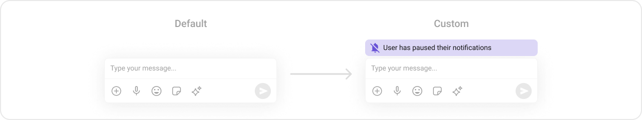 ```kotlin lines theme={null}
val view = LayoutInflater.from(context).inflate(R.layout.custom_header_layout, null)
messageComposer.setHeaderView(view)
```
```kotlin lines theme={null}
CometChatMessageComposer(
user = user,
headerView = {
Card(colors = CardDefaults.cardColors(containerColor = Color(0xFFEDEAFA))) {
Row(Modifier.padding(8.dp), verticalAlignment = Alignment.CenterVertically) {
Icon(painterResource(R.drawable.ic_notes), "Notes")
Spacer(Modifier.width(4.dp))
Text("Notes")
}
}
}
)
```
### Send Button View
Replace the default send button.
```kotlin lines theme={null}
val view = LayoutInflater.from(context).inflate(R.layout.custom_header_layout, null)
messageComposer.setHeaderView(view)
```
```kotlin lines theme={null}
CometChatMessageComposer(
user = user,
headerView = {
Card(colors = CardDefaults.cardColors(containerColor = Color(0xFFEDEAFA))) {
Row(Modifier.padding(8.dp), verticalAlignment = Alignment.CenterVertically) {
Icon(painterResource(R.drawable.ic_notes), "Notes")
Spacer(Modifier.width(4.dp))
Text("Notes")
}
}
}
)
```
### Send Button View
Replace the default send button.
 ```kotlin lines theme={null}
val imageView = ImageView(this)
imageView.setImageResource(R.drawable.custom_send_button)
imageView.setOnClickListener {
Toast.makeText(this, "Custom Send Button Clicked!", Toast.LENGTH_SHORT).show()
}
messageComposer.setSendButtonView(imageView)
```
```kotlin lines theme={null}
CometChatMessageComposer(
user = user,
sendButtonView = {
IconButton(onClick = { /* custom send */ }) {
Icon(painterResource(R.drawable.custom_send_button), "Send")
}
}
)
```
### Auxiliary Button View
Replace the auxiliary button area (stickers, AI).
```kotlin lines theme={null}
val imageView = ImageView(this)
imageView.setImageResource(R.drawable.custom_send_button)
imageView.setOnClickListener {
Toast.makeText(this, "Custom Send Button Clicked!", Toast.LENGTH_SHORT).show()
}
messageComposer.setSendButtonView(imageView)
```
```kotlin lines theme={null}
CometChatMessageComposer(
user = user,
sendButtonView = {
IconButton(onClick = { /* custom send */ }) {
Icon(painterResource(R.drawable.custom_send_button), "Send")
}
}
)
```
### Auxiliary Button View
Replace the auxiliary button area (stickers, AI).
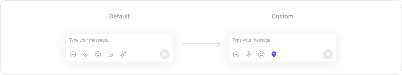 If you override the auxiliary button with `setAuxiliaryButtonView()`, retrieve the default auxiliary buttons via `CometChatUIKit.getDataSource().getAuxiliaryOption()` and include them in your custom layout to preserve sticker/AI buttons.
```kotlin lines theme={null}
val linearLayout = LinearLayout(this)
linearLayout.orientation = LinearLayout.HORIZONTAL
// Preserve default auxiliary buttons
val defaultView = CometChatUIKit.getDataSource().getAuxiliaryOption(
this, user, group,
messageComposer.composerViewModel.getIdMap(),
messageComposer.additionParameter
)
linearLayout.addView(defaultView)
// Add custom button
val customButton = ImageView(this)
customButton.setImageResource(R.drawable.save_icon)
linearLayout.addView(customButton)
messageComposer.setAuxiliaryButtonView(linearLayout)
```
```kotlin lines theme={null}
CometChatMessageComposer(
user = user,
auxiliaryButtonView = {
Row {
// Custom button alongside defaults
IconButton(onClick = { /* action */ }) {
Icon(painterResource(R.drawable.save_icon), "Save")
}
}
}
)
```
### Attachment Options
Replace the default attachment options.
If you override the auxiliary button with `setAuxiliaryButtonView()`, retrieve the default auxiliary buttons via `CometChatUIKit.getDataSource().getAuxiliaryOption()` and include them in your custom layout to preserve sticker/AI buttons.
```kotlin lines theme={null}
val linearLayout = LinearLayout(this)
linearLayout.orientation = LinearLayout.HORIZONTAL
// Preserve default auxiliary buttons
val defaultView = CometChatUIKit.getDataSource().getAuxiliaryOption(
this, user, group,
messageComposer.composerViewModel.getIdMap(),
messageComposer.additionParameter
)
linearLayout.addView(defaultView)
// Add custom button
val customButton = ImageView(this)
customButton.setImageResource(R.drawable.save_icon)
linearLayout.addView(customButton)
messageComposer.setAuxiliaryButtonView(linearLayout)
```
```kotlin lines theme={null}
CometChatMessageComposer(
user = user,
auxiliaryButtonView = {
Row {
// Custom button alongside defaults
IconButton(onClick = { /* action */ }) {
Icon(painterResource(R.drawable.save_icon), "Save")
}
}
}
)
```
### Attachment Options
Replace the default attachment options.
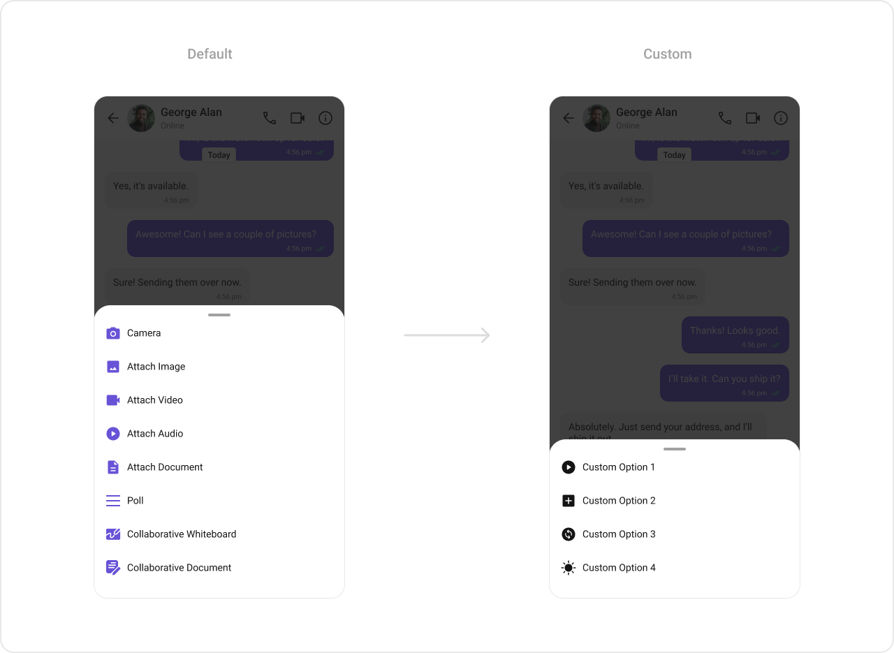 ```kotlin lines theme={null}
val actionList = ArrayList()
val action1 = CometChatMessageComposerAction()
action1.title = "Custom Option 1"
action1.icon = R.drawable.ic_cp_1
action1.onClick = {
Toast.makeText(context, "Custom Option 1", Toast.LENGTH_SHORT).show()
}
actionList.add(action1)
messageComposer.setAttachmentOptions(actionList)
```
```kotlin lines theme={null}
CometChatMessageComposer(
user = user,
attachmentOptions = listOf(
CometChatMessageComposerAction(
title = "Custom Option 1",
icon = R.drawable.ic_cp_1,
onClick = { /* handle */ }
)
)
)
```
### Text Formatters (Mentions)
```kotlin lines theme={null}
val actionList = ArrayList()
val action1 = CometChatMessageComposerAction()
action1.title = "Custom Option 1"
action1.icon = R.drawable.ic_cp_1
action1.onClick = {
Toast.makeText(context, "Custom Option 1", Toast.LENGTH_SHORT).show()
}
actionList.add(action1)
messageComposer.setAttachmentOptions(actionList)
```
```kotlin lines theme={null}
CometChatMessageComposer(
user = user,
attachmentOptions = listOf(
CometChatMessageComposerAction(
title = "Custom Option 1",
icon = R.drawable.ic_cp_1,
onClick = { /* handle */ }
)
)
)
```
### Text Formatters (Mentions)
 ```kotlin lines theme={null}
val mentionFormatter = CometChatMentionsFormatter(context)
mentionFormatter.setMessageComposerMentionTextStyle(context, R.style.CustomMentionsStyle)
val textFormatters: MutableList = ArrayList()
textFormatters.add(mentionFormatter)
messageComposer.setTextFormatters(textFormatters)
```
```kotlin lines theme={null}
val mentionFormatter = CometChatMentionsFormatter(context)
CometChatMessageComposer(
user = user,
textFormatters = listOf(mentionFormatter)
)
```
***
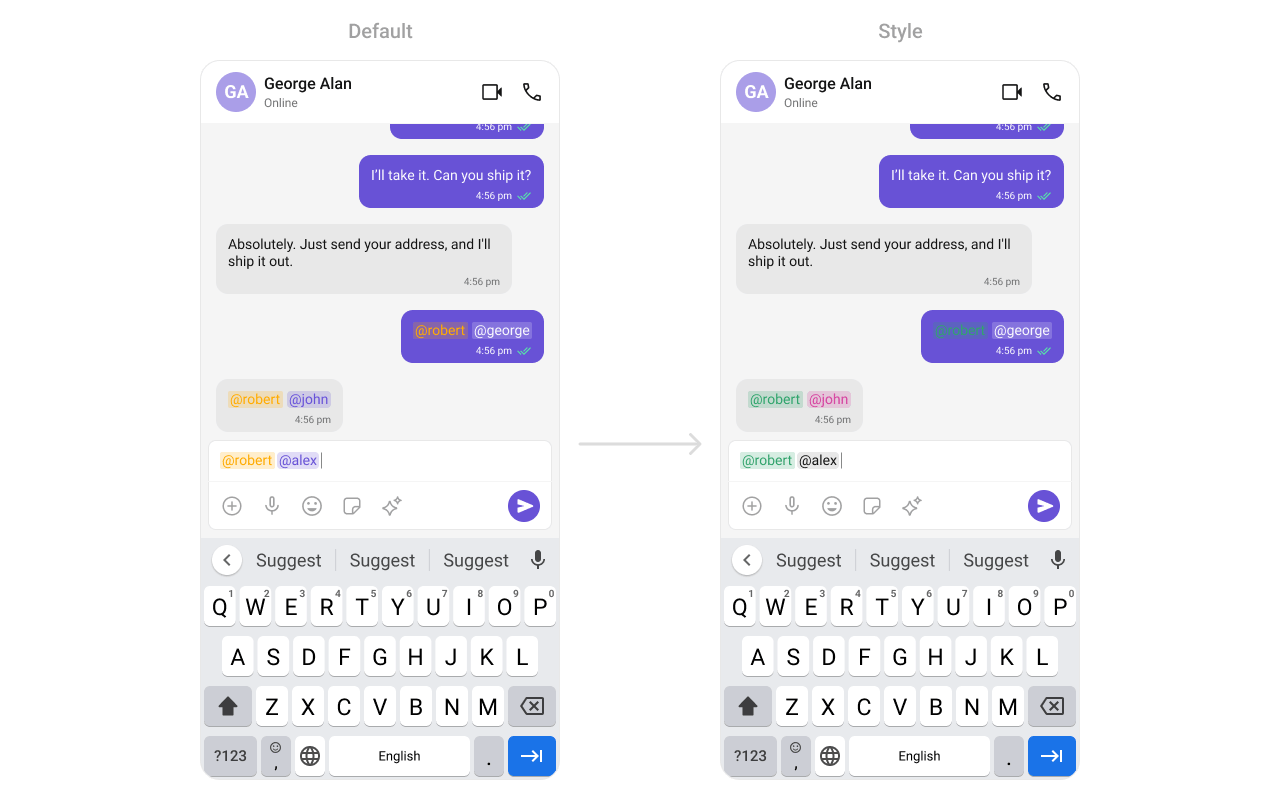
## Style
Define a custom style in `themes.xml`:
```xml themes.xml lines theme={null}
```
```kotlin lines theme={null}
CometChatMessageComposer(
user = user,
style = CometChatMessageComposerStyle.default().copy(
backgroundColor = Color(0xFFFEEDE1),
inputBackgroundColor = Color.White
)
)
```
```kotlin lines theme={null}
val mentionFormatter = CometChatMentionsFormatter(context)
mentionFormatter.setMessageComposerMentionTextStyle(context, R.style.CustomMentionsStyle)
val textFormatters: MutableList = ArrayList()
textFormatters.add(mentionFormatter)
messageComposer.setTextFormatters(textFormatters)
```
```kotlin lines theme={null}
val mentionFormatter = CometChatMentionsFormatter(context)
CometChatMessageComposer(
user = user,
textFormatters = listOf(mentionFormatter)
)
```
***
## Style
Define a custom style in `themes.xml`:
```xml themes.xml lines theme={null}
```
```kotlin lines theme={null}
CometChatMessageComposer(
user = user,
style = CometChatMessageComposerStyle.default().copy(
backgroundColor = Color(0xFFFEEDE1),
inputBackgroundColor = Color.White
)
)
```
 See [Component Styling](/ui-kit/android/v6/component-styling) for the full reference.
***
## ViewModel
```kotlin lines theme={null}
val viewModel = ViewModelProvider(this)
.get(CometChatMessageComposerViewModel::class.java)
```
```kotlin lines theme={null}
messageComposer.setViewModel(viewModel)
```
```kotlin lines theme={null}
CometChatMessageComposer(
user = user,
messageComposerViewModel = viewModel
)
```
See [ViewModel & Data](/ui-kit/android/v6/customization-viewmodel-data) for state observation and custom repositories.
***
## Next Steps
Display messages in a conversation
Display user/group info in the toolbar
Customize message bubble structure
Detailed styling reference
See [Component Styling](/ui-kit/android/v6/component-styling) for the full reference.
***
## ViewModel
```kotlin lines theme={null}
val viewModel = ViewModelProvider(this)
.get(CometChatMessageComposerViewModel::class.java)
```
```kotlin lines theme={null}
messageComposer.setViewModel(viewModel)
```
```kotlin lines theme={null}
CometChatMessageComposer(
user = user,
messageComposerViewModel = viewModel
)
```
See [ViewModel & Data](/ui-kit/android/v6/customization-viewmodel-data) for state observation and custom repositories.
***
## Next Steps
Display messages in a conversation
Display user/group info in the toolbar
Customize message bubble structure
Detailed styling reference