> ## Documentation Index
> Fetch the complete documentation index at: https://cometchat-22654f5b-feature-card-builder.mintlify.site/llms.txt
> Use this file to discover all available pages before exploring further.
# CometChat Card Builder
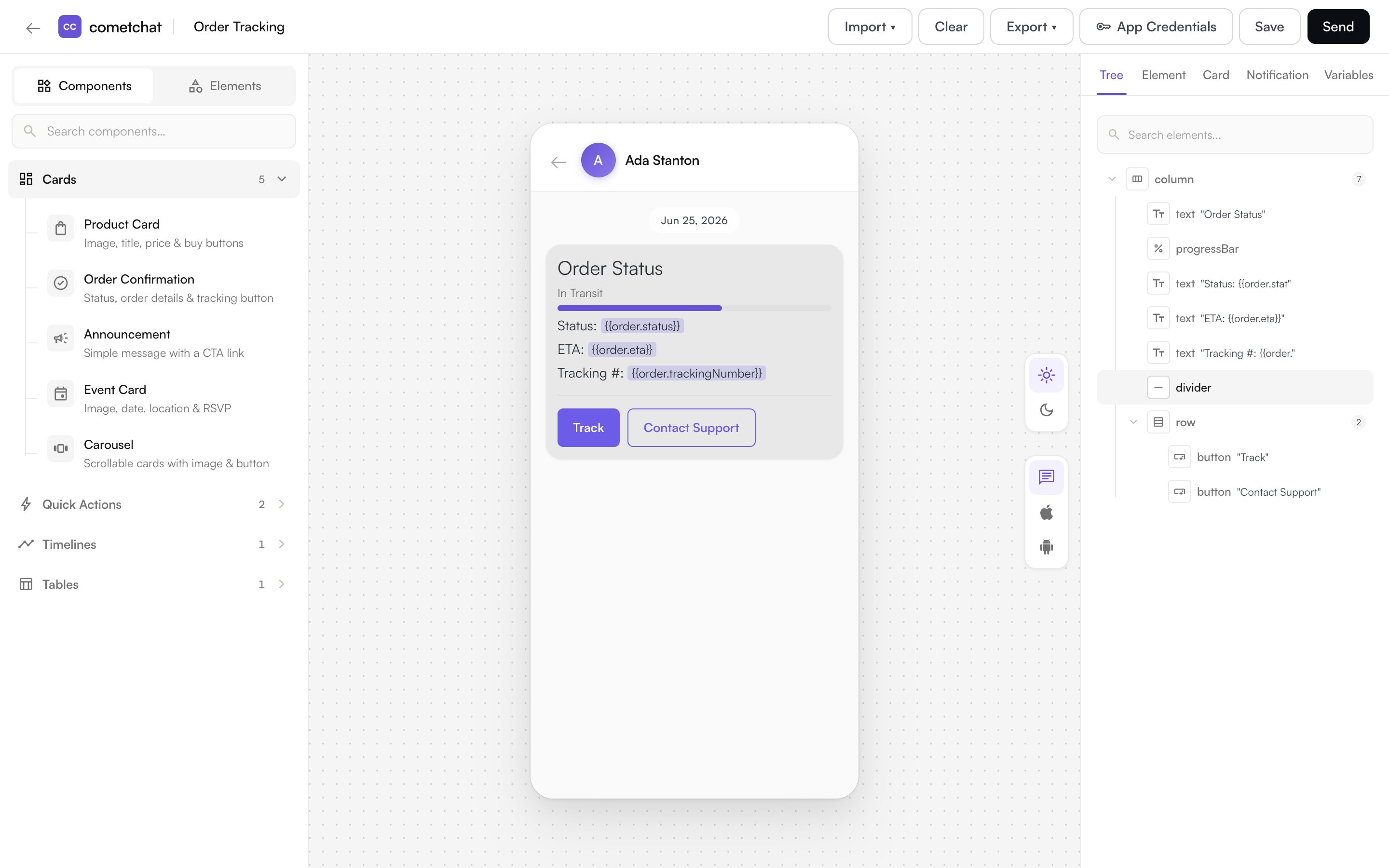
> Card Builder is a visual tool in the CometChat Dashboard for designing rich, interactive card messages — product cards, order confirmations, quick replies, and more — that your CometChat UI Kits render natively.
Card Builder is a visual tool in the [CometChat Dashboard](https://app.cometchat.com) for designing **card messages** — structured, interactive messages such as product cards, order confirmations, event invites, and quick-reply prompts.
Instead of sending plain text, you compose a card visually and CometChat UI Kits render it natively in your chat — with images, buttons, layouts, and actions that respond when a user taps them.
 With Card Builder, you can:
* **Design cards visually** — add text, images, buttons, and layouts and see them on a live canvas.
* **Add interactivity** — wire buttons and links to actions like opening a URL, starting a chat, or making a call.
* **Use variables** — insert placeholders such as `{{user.name}}` that are filled in when the card is sent.
* **Preview in light and dark mode** — set colors for each mode and see the result instantly.
* **Save and reuse templates** — store finished cards and load them again whenever you need them.
## What You Can Build
Start from a blank card, or from a ready-made template — Product Card, Order Confirmation, Order Tracking, Event Card, Announcement, Quick Reply Buttons, and more. See the full set in [Components](/card-builder/elements#components).
## How to Open Card Builder
Card Builder opens in a new browser tab from the dashboard:
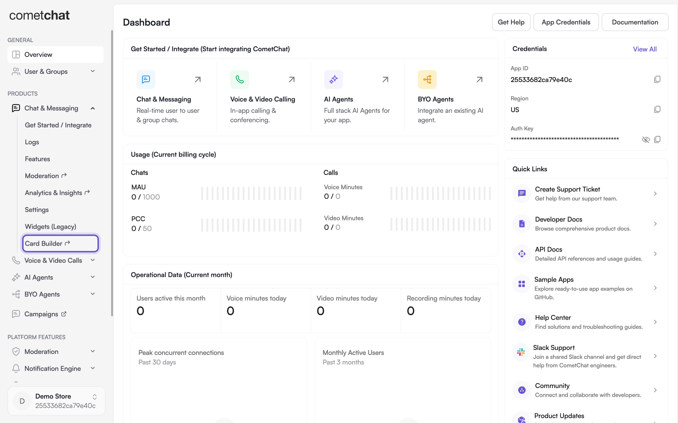
* **For chat** — open your app in the [CometChat Dashboard](https://app.cometchat.com), expand **Chat & Messaging** in the sidebar, and select **Card Builder**.
* **For an AI Agent** — open your agent and select **Card Builder** from the agent configuration menu.
With Card Builder, you can:
* **Design cards visually** — add text, images, buttons, and layouts and see them on a live canvas.
* **Add interactivity** — wire buttons and links to actions like opening a URL, starting a chat, or making a call.
* **Use variables** — insert placeholders such as `{{user.name}}` that are filled in when the card is sent.
* **Preview in light and dark mode** — set colors for each mode and see the result instantly.
* **Save and reuse templates** — store finished cards and load them again whenever you need them.
## What You Can Build
Start from a blank card, or from a ready-made template — Product Card, Order Confirmation, Order Tracking, Event Card, Announcement, Quick Reply Buttons, and more. See the full set in [Components](/card-builder/elements#components).
## How to Open Card Builder
Card Builder opens in a new browser tab from the dashboard:
* **For chat** — open your app in the [CometChat Dashboard](https://app.cometchat.com), expand **Chat & Messaging** in the sidebar, and select **Card Builder**.
* **For an AI Agent** — open your agent and select **Card Builder** from the agent configuration menu.
 Card Builder is available to app owners, admins, and developers.
## The Design Workflow
1. **Choose a starting point** — open a blank card or a template from the library.
2. **Build the card** — add elements from the palette and arrange them with rows, columns, and grids.
3. **Style and preview** — set colors, spacing, and corner radius, and preview in light and dark mode.
4. **Add actions and variables** — make buttons interactive and insert `{{placeholder}}` values.
5. **Save** — save the card as a template to reuse it later.
Continue to [Building Cards](/card-builder/building-cards) for a walkthrough of the editor, or see [Elements & Actions](/card-builder/elements) for everything a card can contain.
Card Builder is available to app owners, admins, and developers.
## The Design Workflow
1. **Choose a starting point** — open a blank card or a template from the library.
2. **Build the card** — add elements from the palette and arrange them with rows, columns, and grids.
3. **Style and preview** — set colors, spacing, and corner radius, and preview in light and dark mode.
4. **Add actions and variables** — make buttons interactive and insert `{{placeholder}}` values.
5. **Save** — save the card as a template to reuse it later.
Continue to [Building Cards](/card-builder/building-cards) for a walkthrough of the editor, or see [Elements & Actions](/card-builder/elements) for everything a card can contain.