> ## Documentation Index
> Fetch the complete documentation index at: https://cometchat-22654f5b-feature-card-builder.mintlify.site/llms.txt
> Use this file to discover all available pages before exploring further.
# Building an Order Status Card
> Step-by-step guide to building an interactive Order Status card from scratch in Card Builder — a heading, a progress bar, status rows with variables, a divider, and two action buttons in a row.
This guide builds an **Order Status** card from a blank canvas — the kind of card you might send when a customer's order ships. You'll add each element yourself: a heading, a progress bar, three status rows driven by variables, a divider, and two action buttons side by side.
## What You'll Build
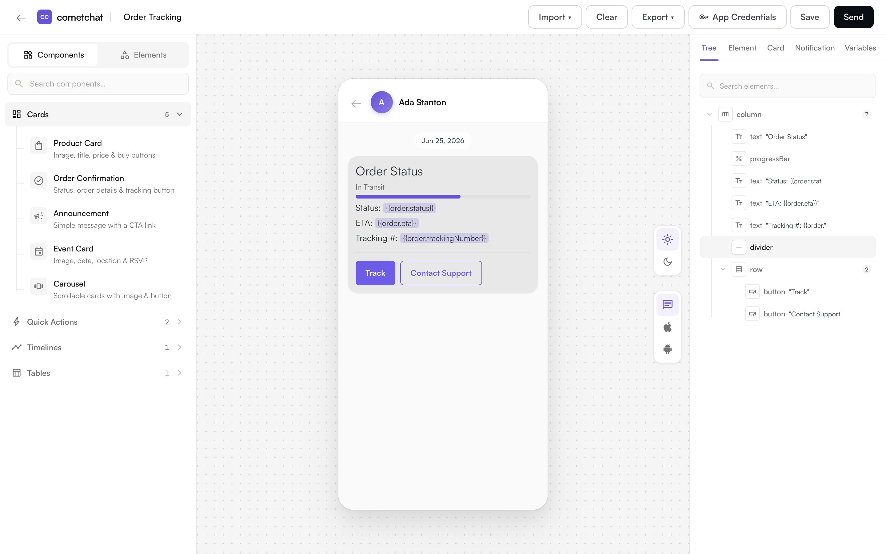
A single card that shows order status at a glance and lets the customer act on it:
* An **Order Status** heading (heading style)
* A **progress bar** labelled **In Transit**, filled to the current stage
* Three rows — **Status**, **ETA**, and **Tracking #** — filled from `{{order.*}}` variables
* A **divider**
* Two buttons in a **row** — **Track** and **Contact Support**
## Prerequisites
* Access to **Card Builder** in your app — see [Overview](/card-builder/overview) for how to open it.
* Familiarity with the editor layout — see [Building Cards](/card-builder/building-cards).
## Steps
### Step 1 — Start a blank card
In the template library, click **+ New Card**. The editor opens with an empty canvas ("Click an element or component to add it here"). Switch the left palette to the **Elements** tab — elements are grouped under **Layout**, **Content**, **Data Display**, and **Actions**.
### Step 2 — Add the heading
From **Content**, click **Text** to add it, then in the **Element** tab set its content to `Order Status` and change its **Variant** to **heading2**.
### Step 3 — Add the progress bar and status rows
From **Data Display**, add a **Progress Bar**. In the Element tab set its **Value** to `60` and its **Label** to `In Transit` (the label renders just below the heading).
Then add three more **Text** elements and, in each, type the label and insert a [variable](/card-builder/building-cards#6-use-variables) from the variable picker:
| Text element | Content |
| ------------ | -------------------------------------- |
| Status | `Status: {{order.status}}` |
| ETA | `ETA: {{order.eta}}` |
| Tracking # | `Tracking #: {{order.trackingNumber}}` |
Variables are resolved to real values when the card is sent, so one card personalizes for every order.
### Step 4 — Add a divider and the buttons
From **Layout**, add a **Divider**. Then add a **Row** so the buttons sit side by side — with the row selected, add a **Button** (it nests inside the row) and set its label to `Track`. Select the row again, add a second **Button**, and label it `Contact Support`.
### Step 5 — Give the buttons their actions
Select a button, scroll to the **Action** section, and choose an [action](/card-builder/elements#actions):
* **Track** → **Open URL**, with the URL `https://example.com/track/{{order.trackingNumber}}` (variables work in URLs too).
* **Contact Support** → **Chat with user**, with the support agent's user ID.
### Step 6 — Set the message type and fallback text
Open the **Card** tab. Set the message **Type** to `order_status` — a meaningful identifier your app can use to recognize this kind of card (it defaults to `custom_type`).
Then fill in **Fallback Text**. This is what a CometChat UI Kit renders if it ever **can't display the card itself** — for example if the card JSON is malformed or the client doesn't support cards — so the message still conveys its meaning. Because the card (and its buttons) won't be shown in that case, write plain copy that **stands on its own** and doesn't reference interactive elements like "tap Track". For this card:
> Your order is in transit. We'll notify you when it's out for delivery.
### Step 7 — Save
Give the card a name (for example, **Order Status**) in the top bar and click **Save**. It now appears under **Saved Templates** and can be reused or edited any time.
 ## Next steps
* Browse what else a card can hold in [Elements & Actions](/card-builder/elements).
* Reuse this card as a [saved template](/card-builder/building-cards#8-save) for future orders.
## Next steps
* Browse what else a card can hold in [Elements & Actions](/card-builder/elements).
* Reuse this card as a [saved template](/card-builder/building-cards#8-save) for future orders.