> ## Documentation Index
> Fetch the complete documentation index at: https://cometchat-22654f5b-feature-card-builder.mintlify.site/llms.txt
> Use this file to discover all available pages before exploring further.
# Building Cards
> Walk through the Card Builder editor — the canvas, the element palette, and the properties panel — to design, style, and save a card in the CometChat Dashboard.
This guide walks through designing a card in Card Builder, from a blank canvas to a saved template.
## The Editor
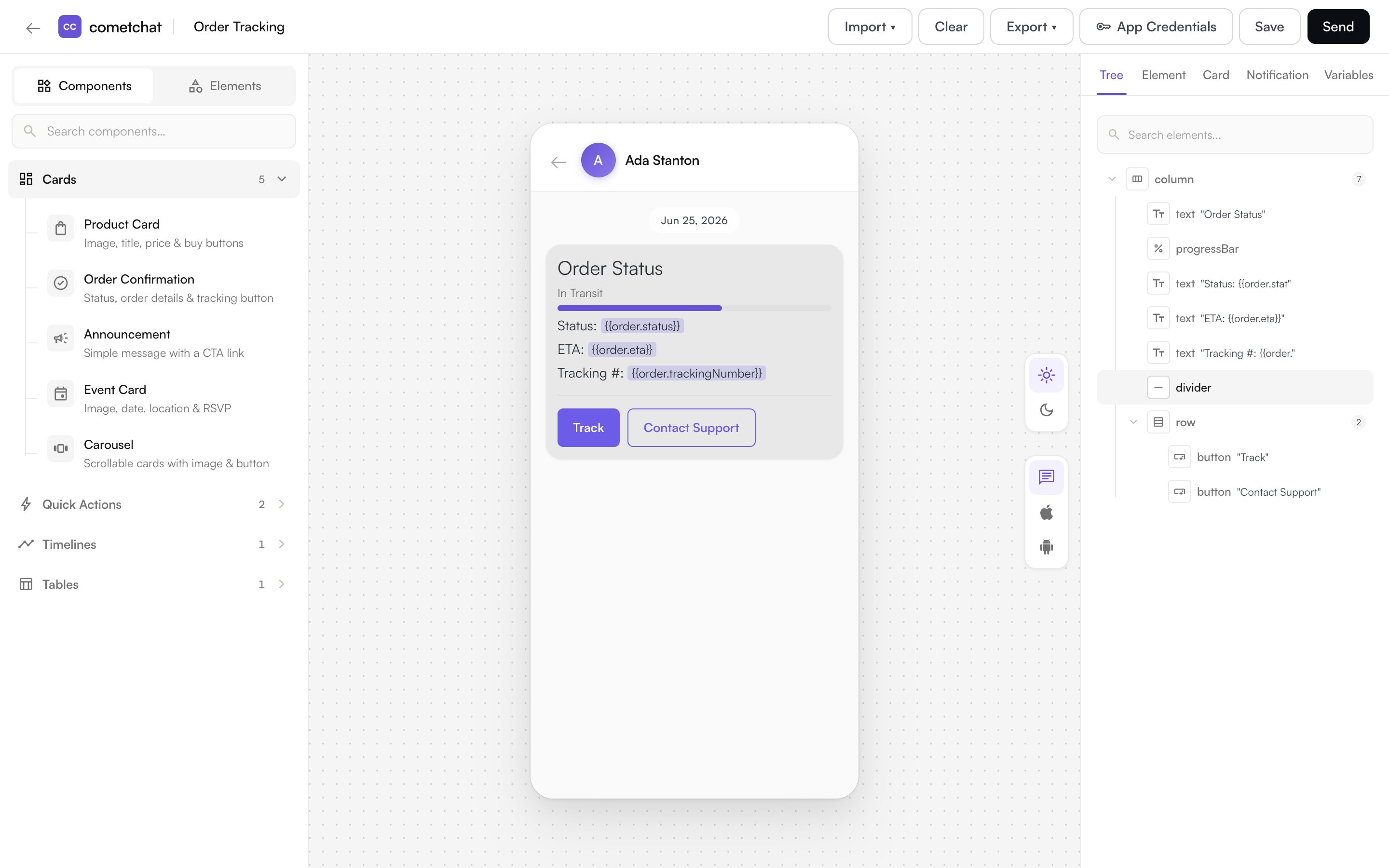
Card Builder is organized into three areas:
| Area | What it does |
| ---------------------- | ------------------------------------------------------------------------------------- |
| **Palette** (left) | The elements and ready-made components you can add to a card. |
| **Canvas** (center) | A live preview of your card as you build it. Select an element here to edit it. |
| **Properties** (right) | Settings for the selected element, the card structure (tree), and overall card style. |
The top bar holds the card name, import and export, undo/redo, and **Save**.
 ## 1. Start a Card
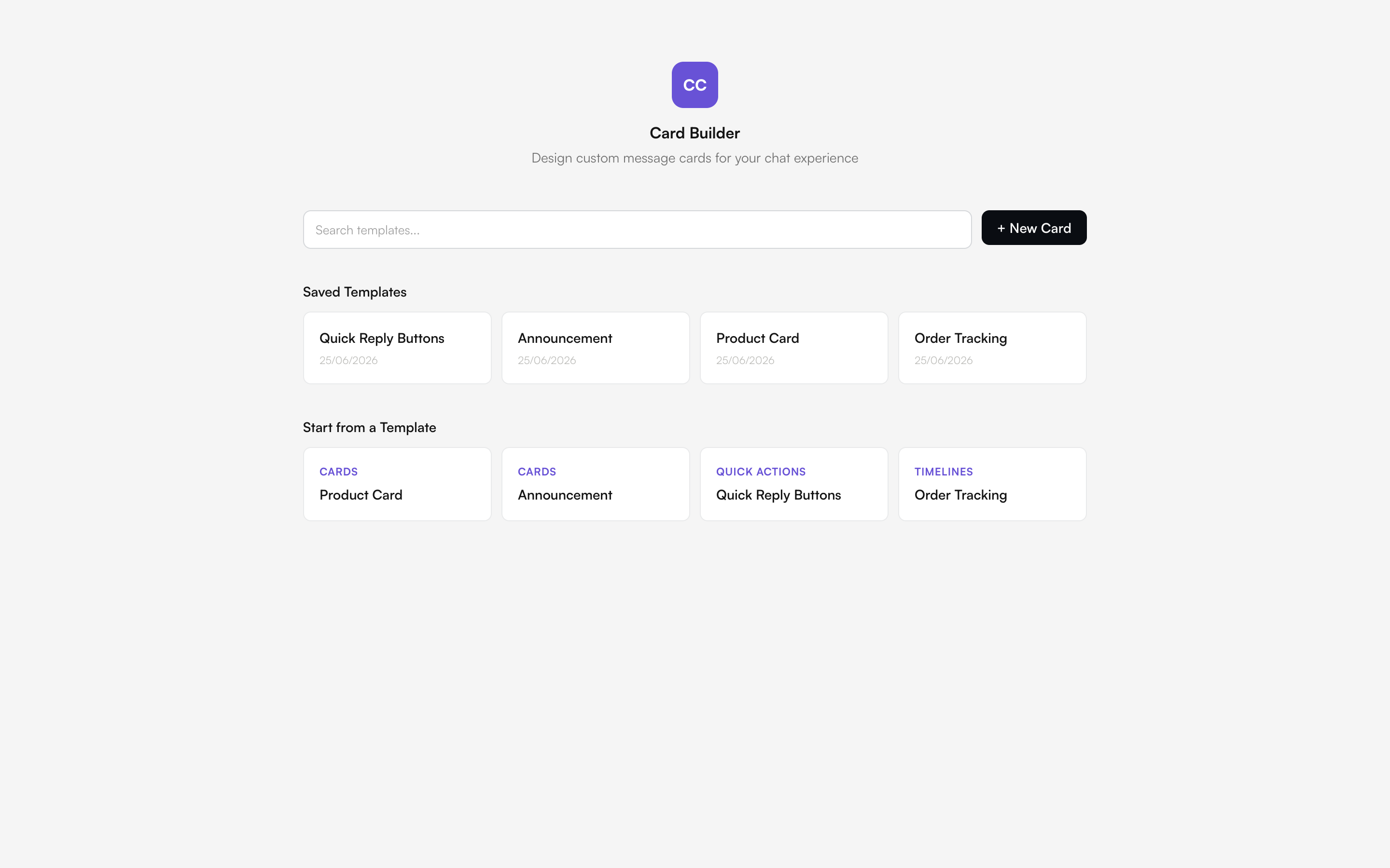
When you open Card Builder, choose a starting point:
* **Template library** — pick a ready-made template (Product Card, Order Confirmation, and more) and customize it.
* **Blank card** — start from scratch.
## 1. Start a Card
When you open Card Builder, choose a starting point:
* **Template library** — pick a ready-made template (Product Card, Order Confirmation, and more) and customize it.
* **Blank card** — start from scratch.
 ## 2. Add Elements
Click an element in the palette to add it to your card. New elements are placed relative to your current selection — inside a selected layout element, or after the selected element. You can add content such as text, images, and buttons, and arrange them using layout elements like rows, columns, and grids. For the full list, see [Elements & Actions](/card-builder/elements).
You can also add a **component** — a pre-built group of elements (for example a product card or an order timeline) — and then edit its pieces.
## 3. Arrange the Layout
By default, elements stack vertically. To change the layout:
* **Row** — place elements side by side.
* **Column** — group elements vertically inside a row.
* **Grid** — arrange elements in a grid.
* **Carousel** — let users scroll horizontally through items.
Use the structure tree in the properties panel to drag elements into a new order, nest them inside layouts, or remove them.
## 4. Style the Card
Select an element to edit its properties, or click an empty area of the card to edit the overall **card style**:
* **Background** — set a fill color, or make it transparent.
* **Corner radius** — round the card's corners.
* **Border** — add a border color and width.
* **Padding** — control the spacing inside the card.
### Light and Dark Mode
Colors are set separately for **light** and **dark** mode, so your card looks right in both. You can set a color for one mode and leave the other transparent.
## 5. Make It Interactive
Add an **action** to a button, icon button, link, or chip so it does something when tapped — open a URL, start a chat, send a message, make a call, and more. See [Elements & Actions](/card-builder/elements#actions) for the full list.
## 6. Use Variables
Insert [variables](/card-builder/elements#variables) — placeholders such as `{{user.name}}` or `{{order.id}}` — from the variable picker wherever you enter text or a URL. They're filled with real values when the card is sent, so a single card personalizes for every recipient. Available variables depend on where the card is used.
## 7. Notifications (Push)
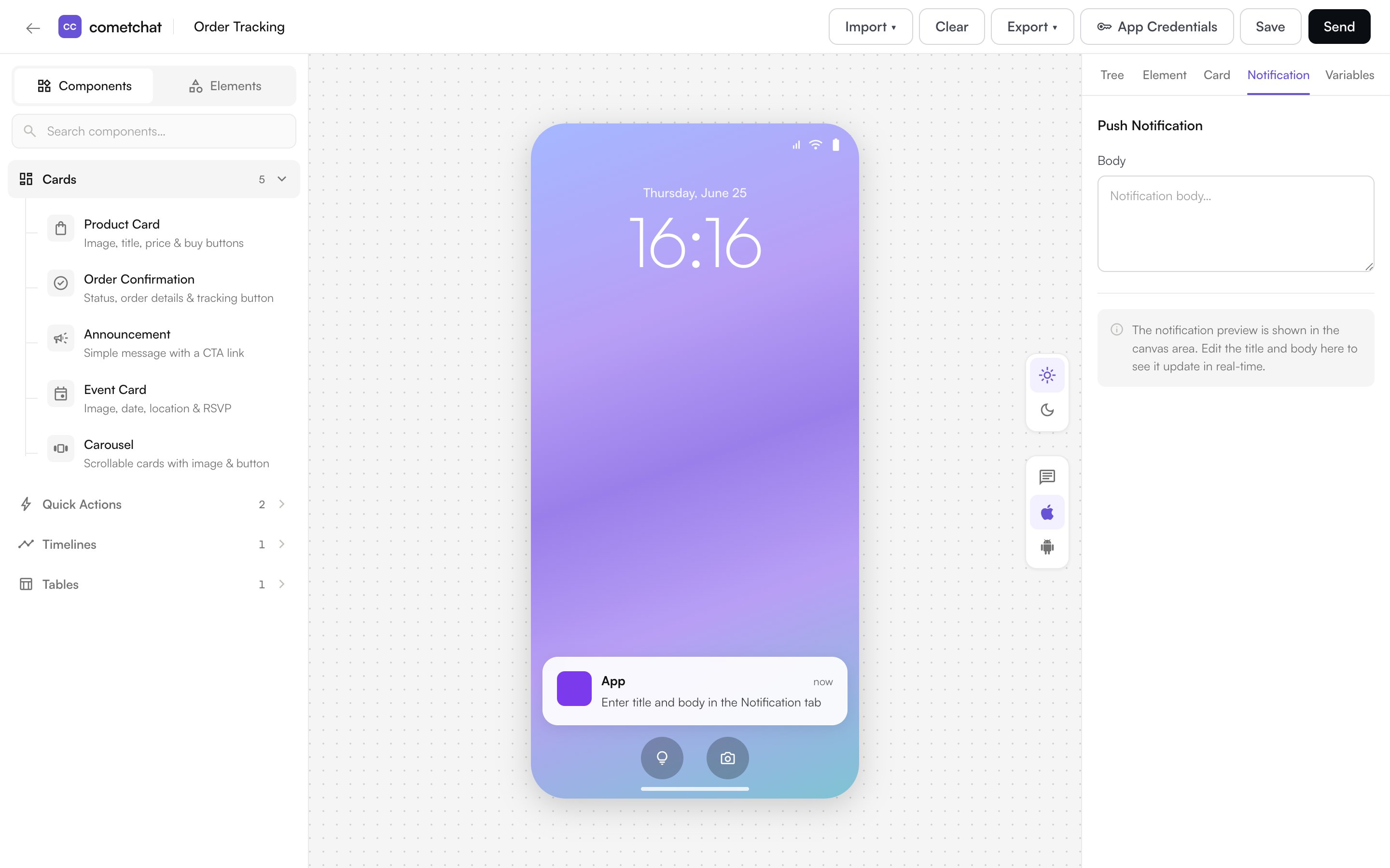
A card is a message in CometChat. When that message triggers a push notification, the push can't show the full rich card — so the **Notification** tab is where you define the **notification text** for the message: the title and body shown in the push. A device preview shows how it will appear, and you can insert [variables](#6-use-variables) into the title and body so the notification is personalized per recipient.
## 2. Add Elements
Click an element in the palette to add it to your card. New elements are placed relative to your current selection — inside a selected layout element, or after the selected element. You can add content such as text, images, and buttons, and arrange them using layout elements like rows, columns, and grids. For the full list, see [Elements & Actions](/card-builder/elements).
You can also add a **component** — a pre-built group of elements (for example a product card or an order timeline) — and then edit its pieces.
## 3. Arrange the Layout
By default, elements stack vertically. To change the layout:
* **Row** — place elements side by side.
* **Column** — group elements vertically inside a row.
* **Grid** — arrange elements in a grid.
* **Carousel** — let users scroll horizontally through items.
Use the structure tree in the properties panel to drag elements into a new order, nest them inside layouts, or remove them.
## 4. Style the Card
Select an element to edit its properties, or click an empty area of the card to edit the overall **card style**:
* **Background** — set a fill color, or make it transparent.
* **Corner radius** — round the card's corners.
* **Border** — add a border color and width.
* **Padding** — control the spacing inside the card.
### Light and Dark Mode
Colors are set separately for **light** and **dark** mode, so your card looks right in both. You can set a color for one mode and leave the other transparent.
## 5. Make It Interactive
Add an **action** to a button, icon button, link, or chip so it does something when tapped — open a URL, start a chat, send a message, make a call, and more. See [Elements & Actions](/card-builder/elements#actions) for the full list.
## 6. Use Variables
Insert [variables](/card-builder/elements#variables) — placeholders such as `{{user.name}}` or `{{order.id}}` — from the variable picker wherever you enter text or a URL. They're filled with real values when the card is sent, so a single card personalizes for every recipient. Available variables depend on where the card is used.
## 7. Notifications (Push)
A card is a message in CometChat. When that message triggers a push notification, the push can't show the full rich card — so the **Notification** tab is where you define the **notification text** for the message: the title and body shown in the push. A device preview shows how it will appear, and you can insert [variables](#6-use-variables) into the title and body so the notification is personalized per recipient.
 ## 8. Save
Give the card a name in the top bar and click **Save**. Saved cards are stored as templates so you can open them again from the template library, edit them, and reuse them.
***
Next: [Elements & Actions](/card-builder/elements) — a reference of everything you can add to a card.
## 8. Save
Give the card a name in the top bar and click **Save**. Saved cards are stored as templates so you can open them again from the template library, edit them, and reuse them.
***
Next: [Elements & Actions](/card-builder/elements) — a reference of everything you can add to a card.